A Viennese Double – Dürer versus Caravaggio and Bernini

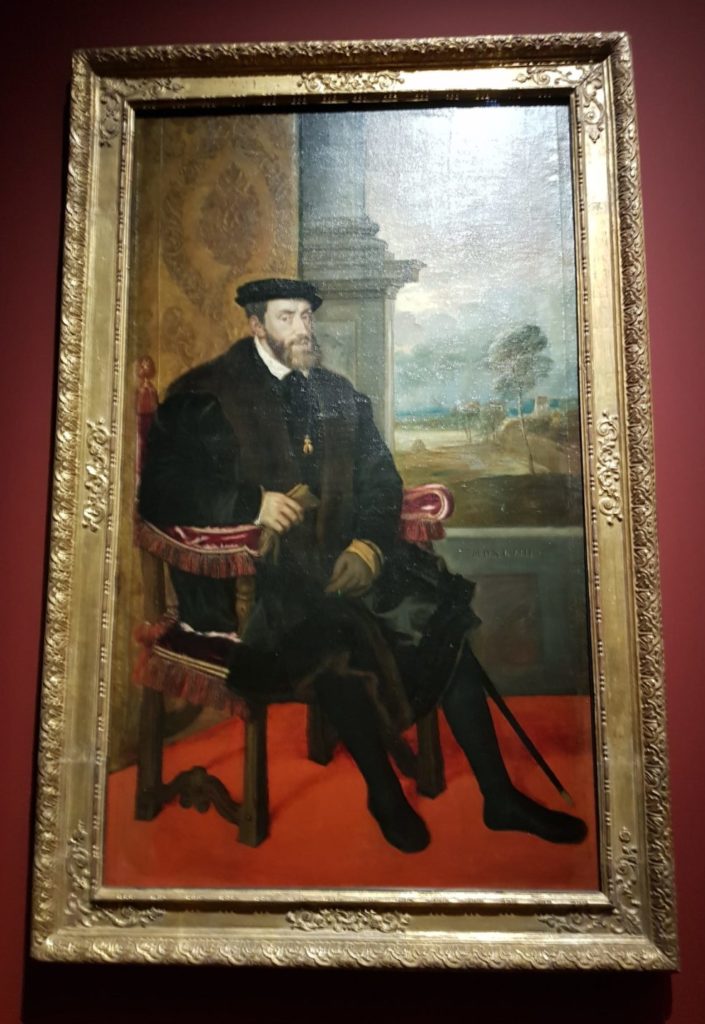
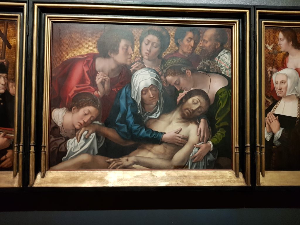
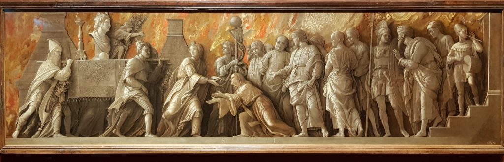
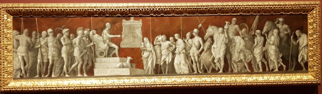
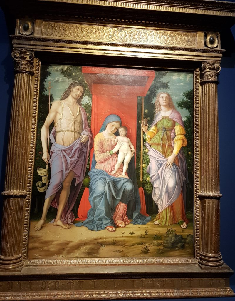
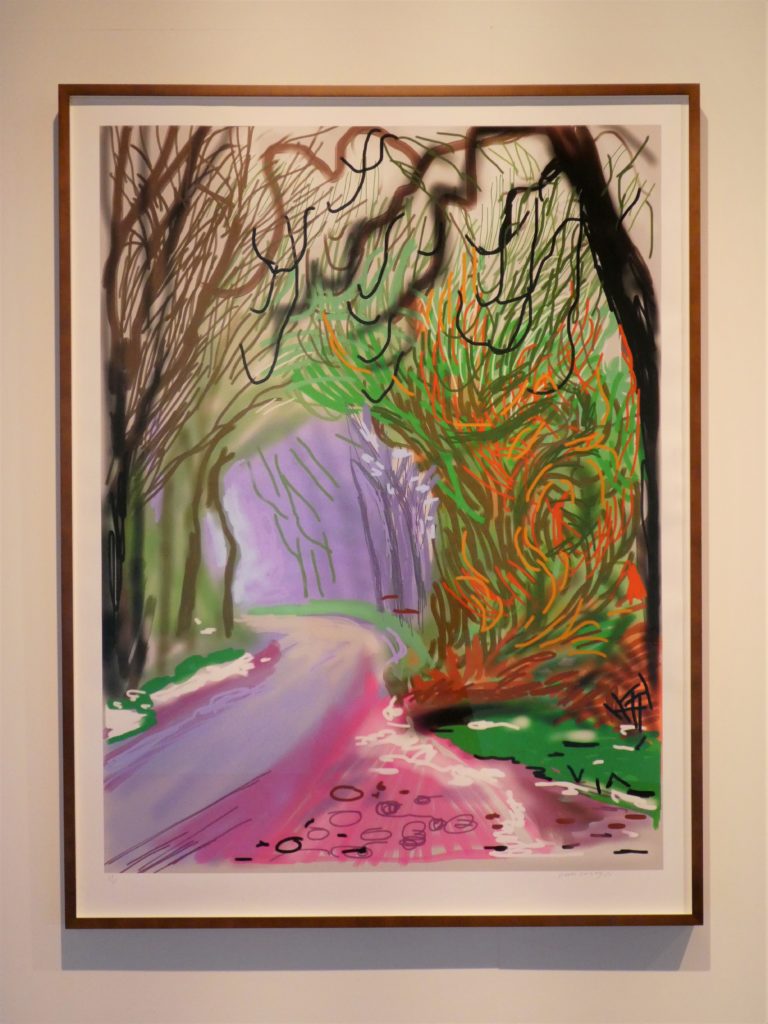
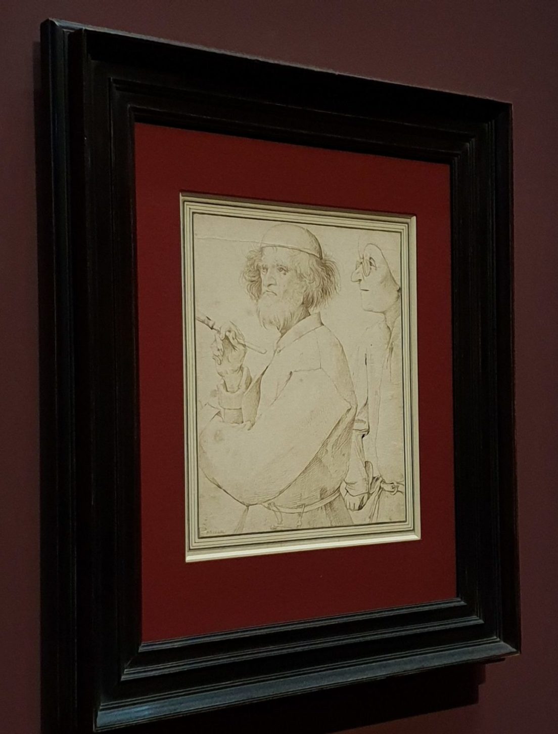
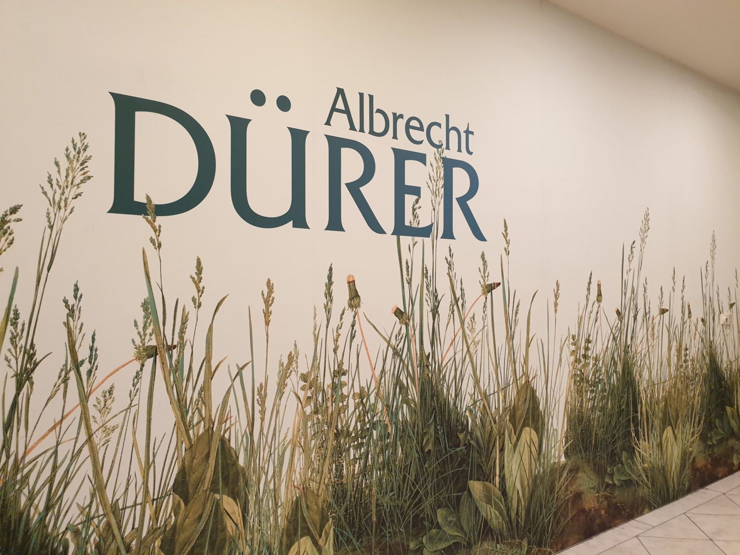
Almost every year I happen to be in Vienna around the Christmas holidays. This gives me the privilege to be able to view two big fall/winter exhibitions usually presented by two of Vienna’s most important museums, shortly before they close in mid-January.  Last year I experienced a wonderful Monet show in the Albertina, as well as a once-in-a-lifetime exhibition on Bruegel in the Kunsthistorisches Museum. This year it was the turn of a huge Dürer retrospective in the Albertina, and an exhibition called Caravaggio & Bernini – The Discovery Of Emotions in the Kunsthistorisches Museum.

A Matter Of Choices

The amount of cultural input for the eyes, the mind, and the soul is almost too much “to digest” at once. Especially when one has in mind to contribute to this blog by writing an article, and needs to choose a topic. Seeing two big exhibitions one after the other makes one unintentionally draw comparisons, at least concerning the way the shows are being curated and presented. Not having studied art history I don’t know what concepts of art-presentation exist. But seeing two big shows in a row, in two consecutive years gave me the impression that the museum’s director sets the agenda on the way a prestigious exhibition is being approached and showcased, of course in a constant interchange with the exhibition’s curator.  In the end, it is a matter of taste and choices.

Different Approaches

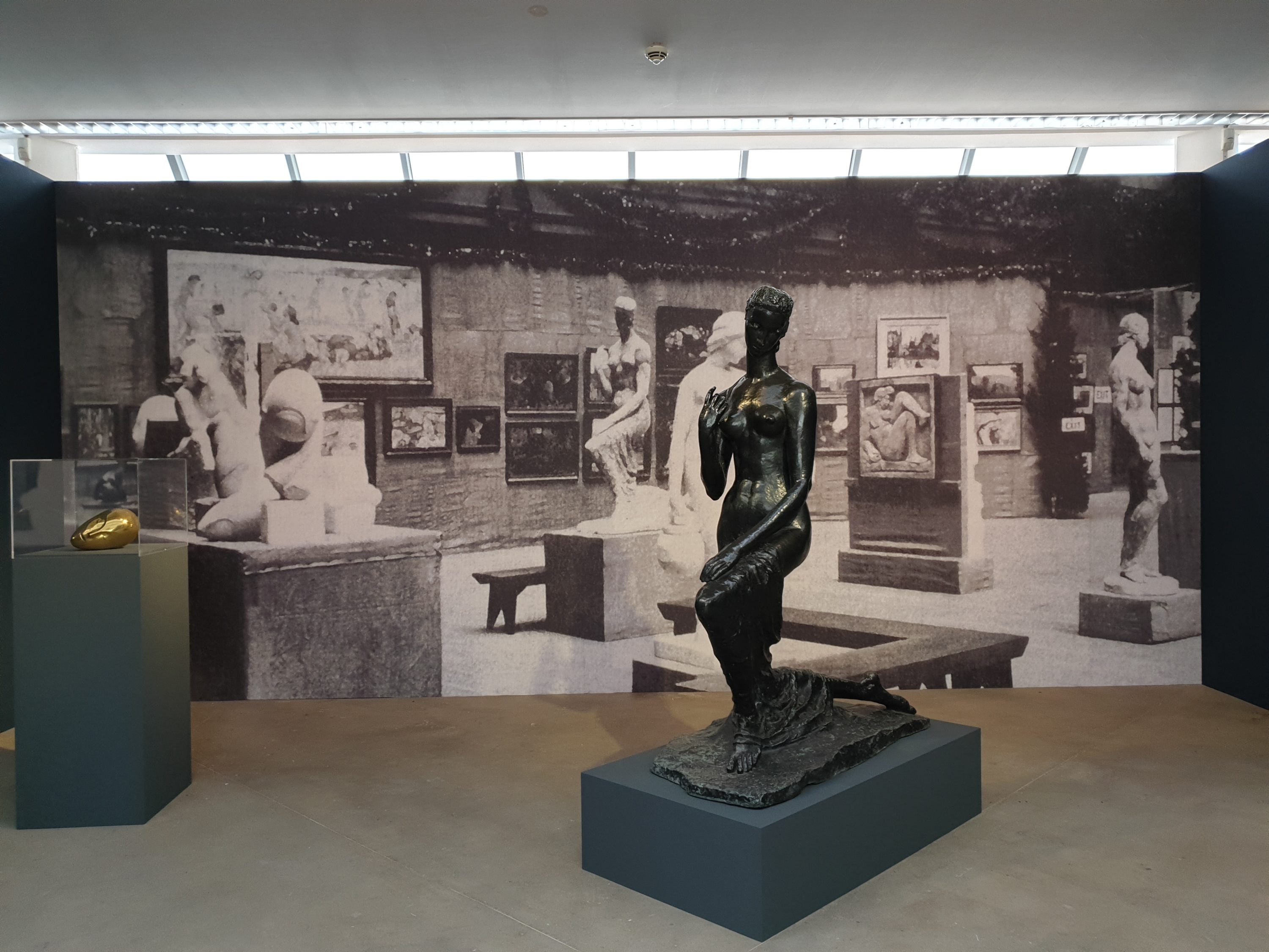
The Albertina follows a mostly chronological narrative in opposition to the Kunsthistorisches Museum’s rather thematical approach. Both methods have their merits, but I prefer the room-wise concentration on certain aspects of artistic creation which points out correlations, parallels as well as differences. Thus, it is easier to follow the exhibition and make own observations and discoveries, even without being a connoisseur.

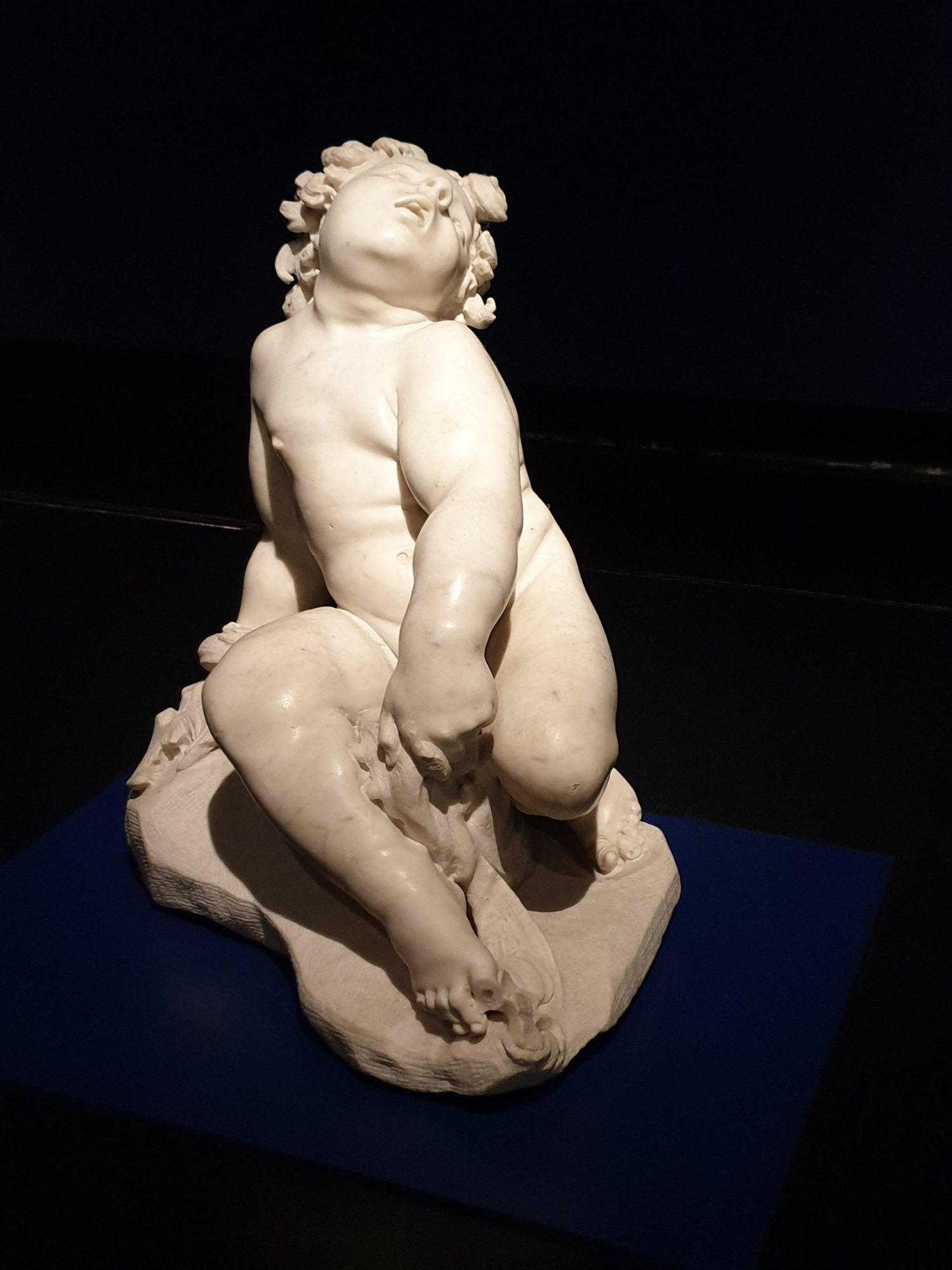
A Dialog Between Painting And Sculpture

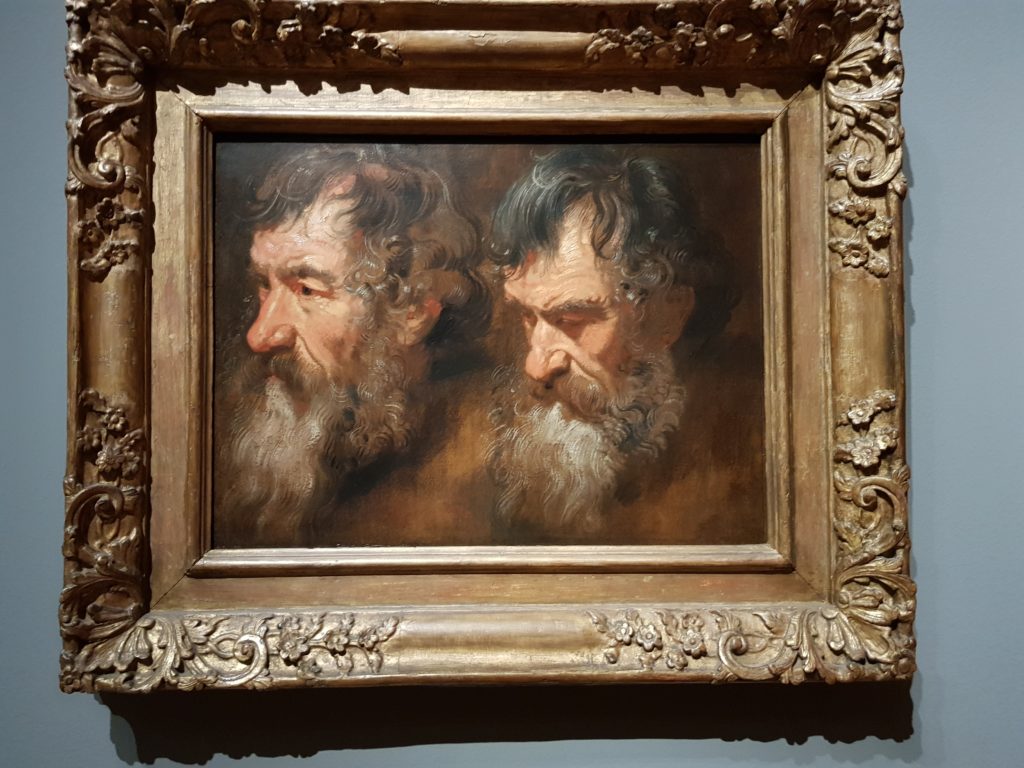
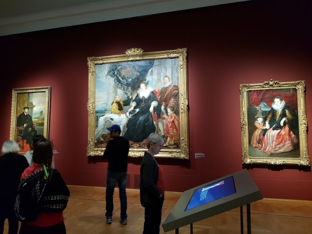
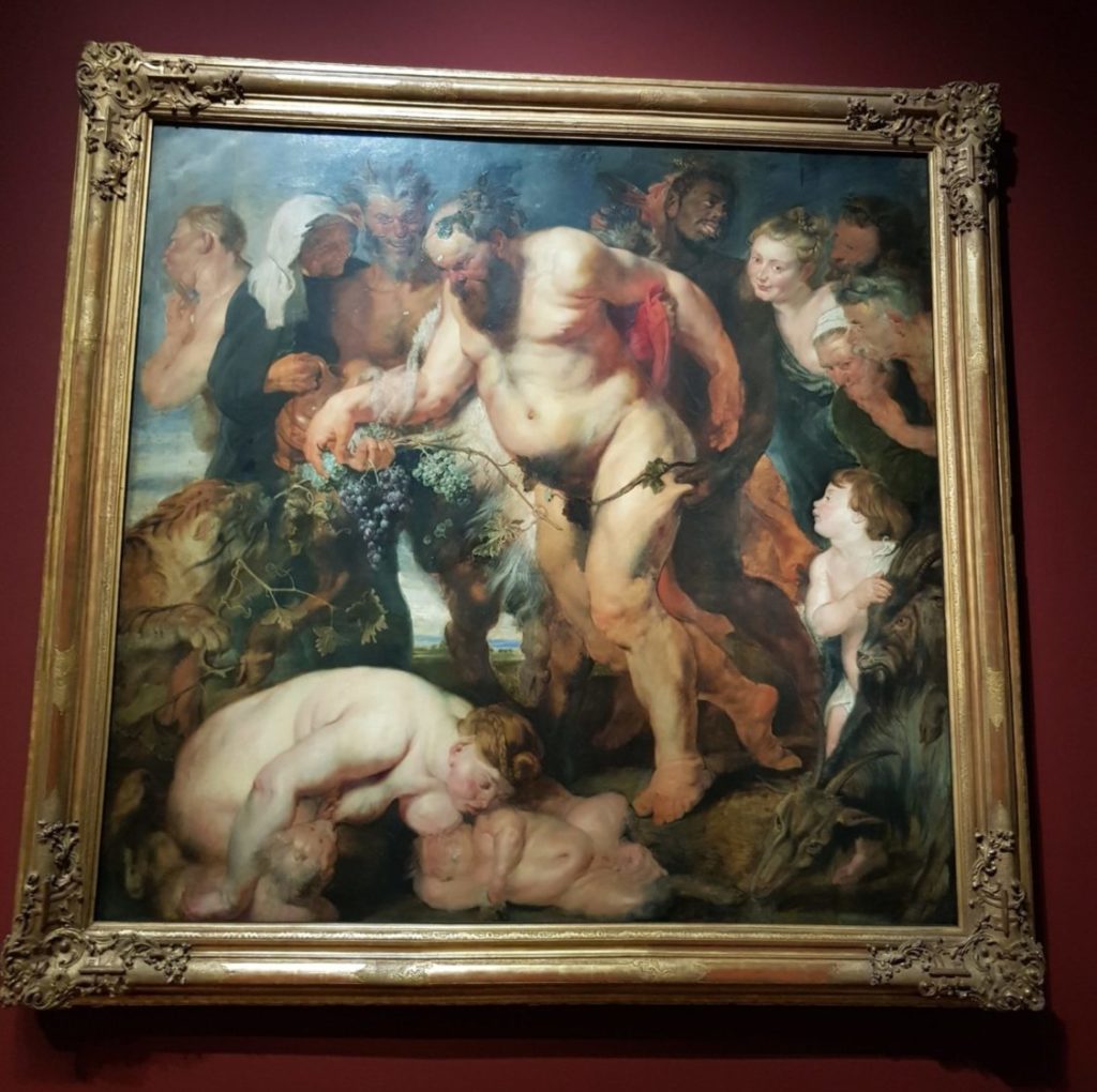
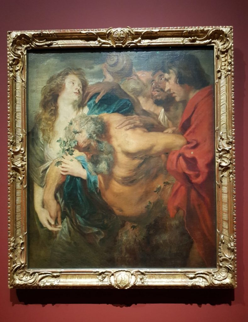
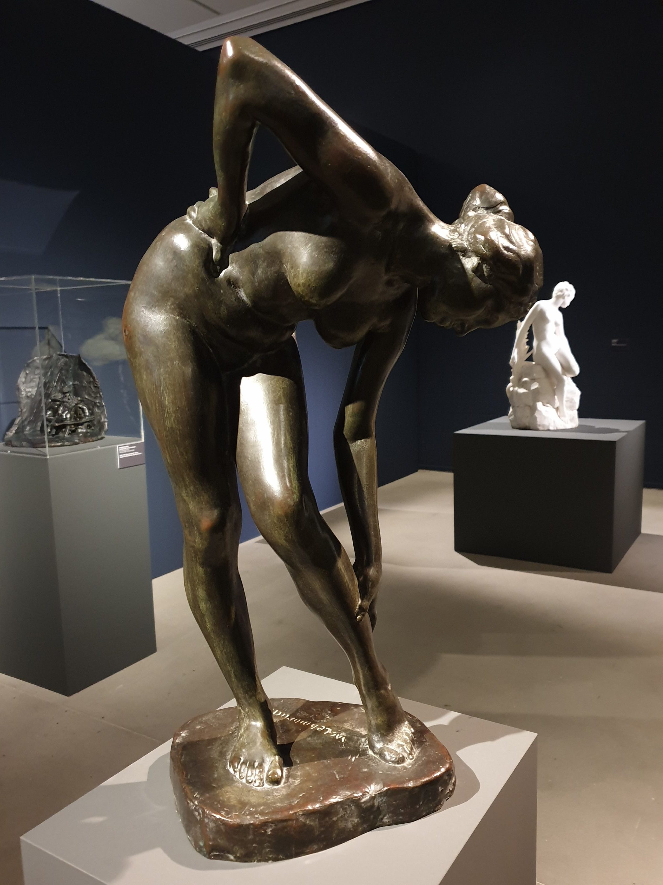
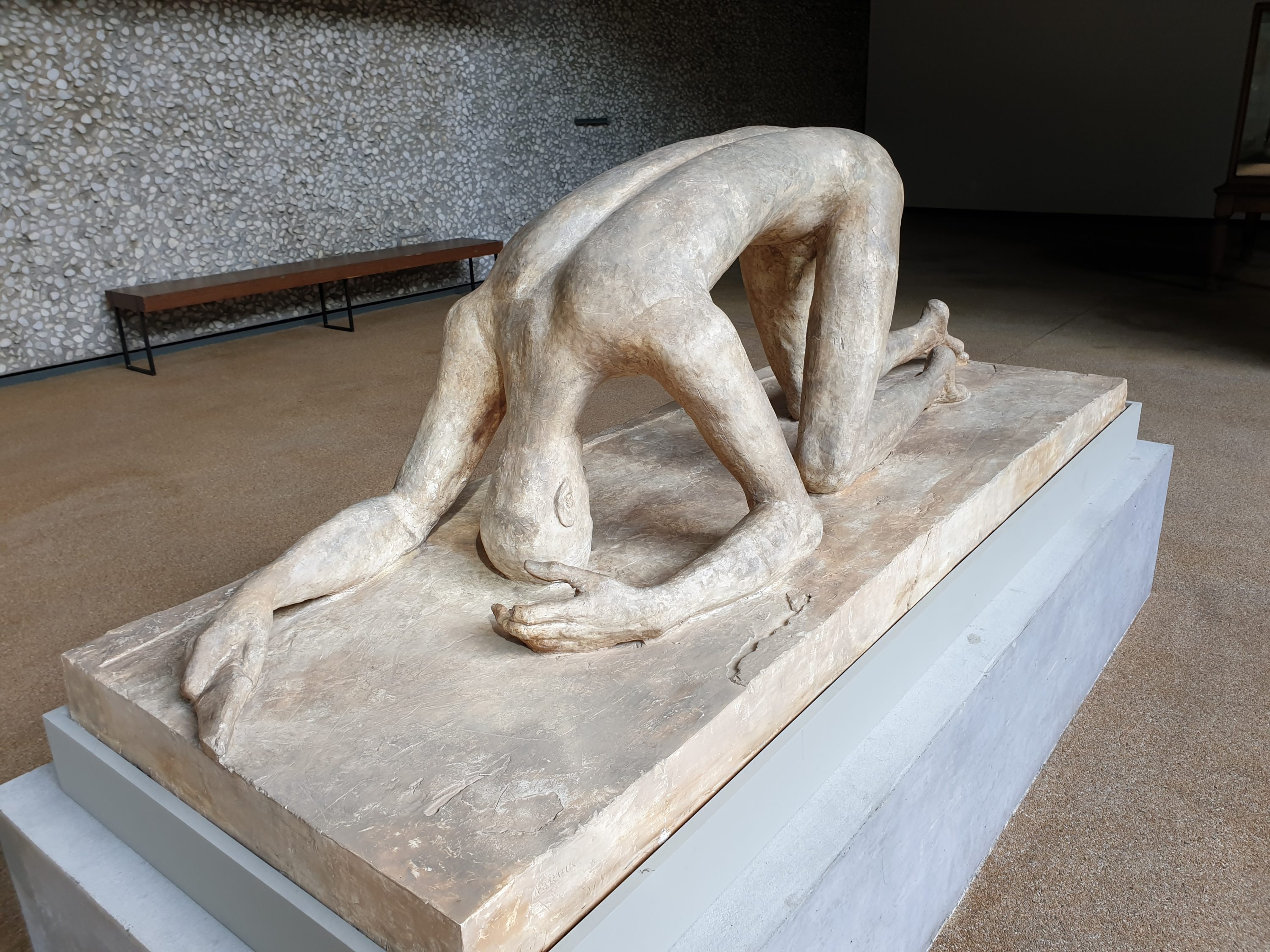
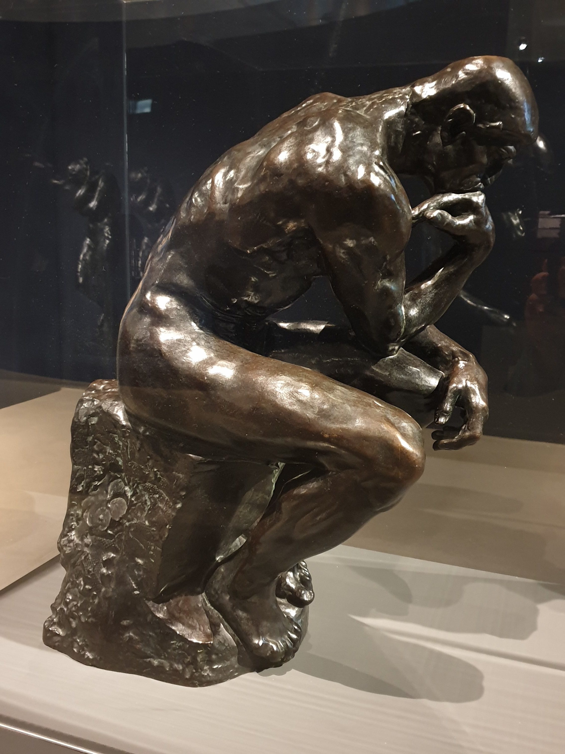
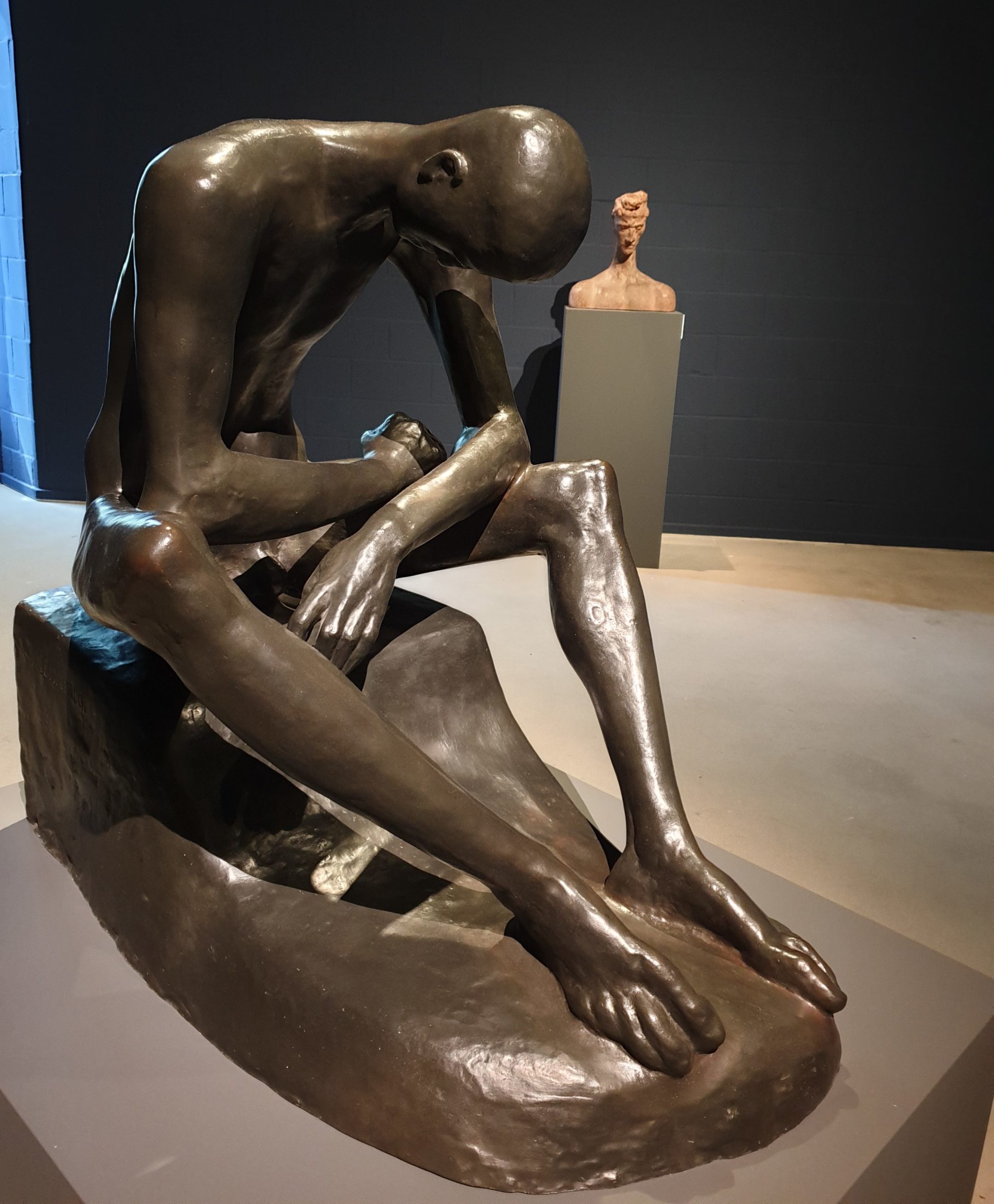
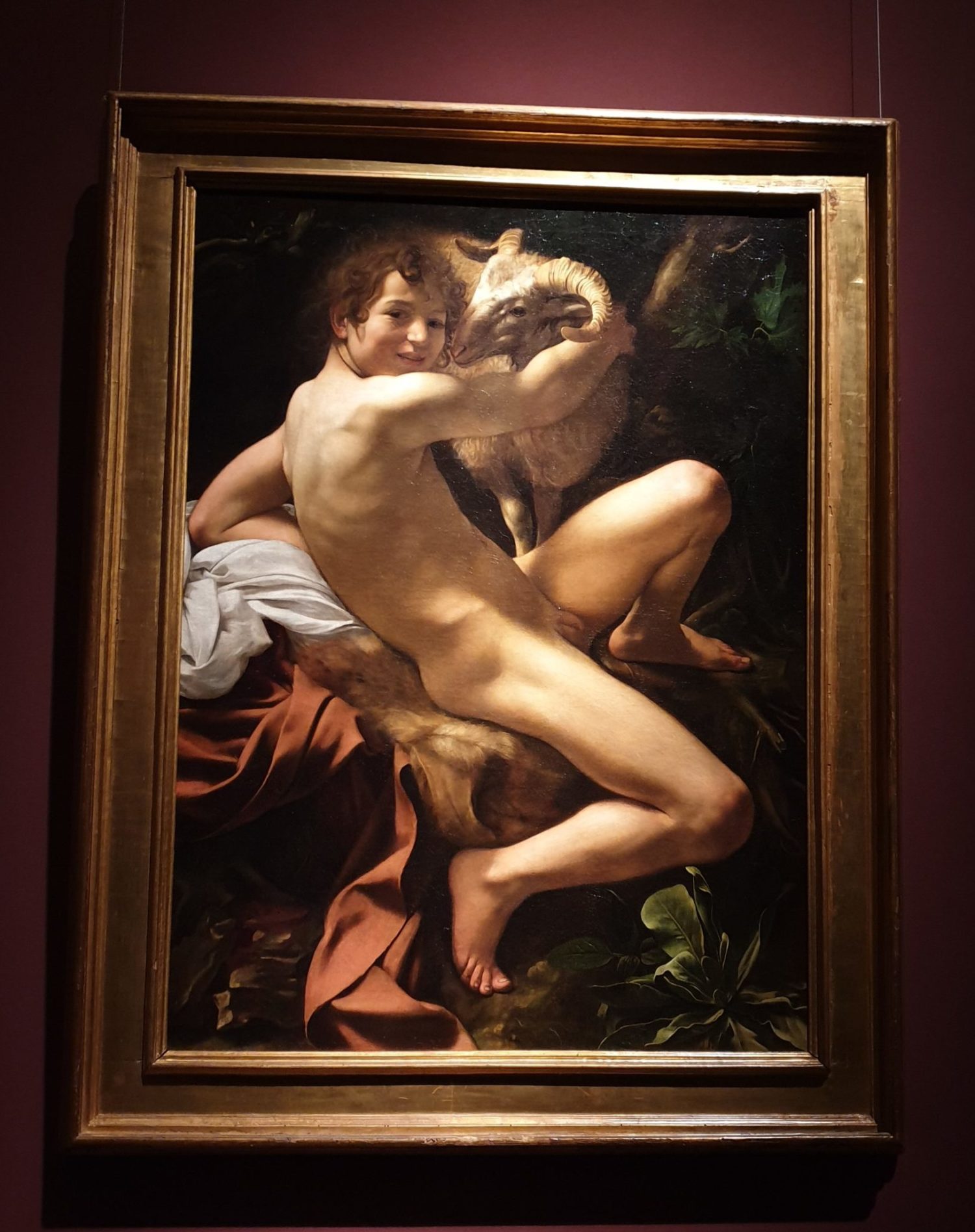
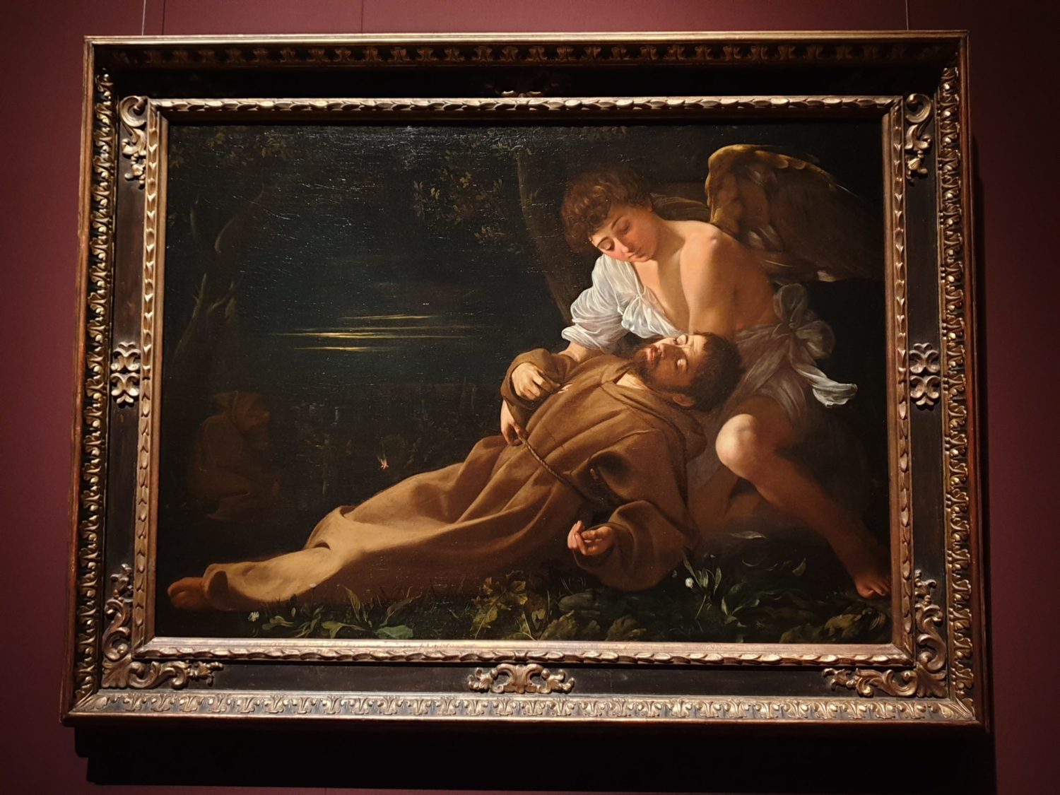
In the case of the Caravaggio – Bernini exhibition, this way of show-casing proves to be essential, as the number of exhibits by the two masters is not as numerous as the title might suggest. The subtitle – The Discovery Of Emotions – is more accurate in describing the show’s content and layout. By building eight units of emotions or “affects”, as I would rather name them following the doctrine of affects in baroque music, the museum introduces its visitors to the baroque way of thinking, looking and feeling. It points out both Caravaggio’s and Bernini’s interest and artistry in depicting as well as evoking strong feelings and passions in the spectator. To do so, it opens up a dialog between painting and sculpture.

Michelangelo Merisi da Caravaggio, St John The Baptist, ca. 1602, Canvas
Gian Lorenzo Bernini A Putto Bitten by a Dolphin, ca. 1618, Marble


Quality And Quantity

On the other hand, the Dürer retrospective scores already by the number of valuable originals, many of which are in the museum’s permanent collection but cannot be shown regularly. As the exhibition’s introductory notice points out, “Dürer’s drawn oeuvre offers a complete picture of both his genesis as an artist and his reflections on art. This fact is due to the remarkable care with which the artist saw to the stock of his own drawings.” The Nürnberg born artist seems to have systematically consolidated and organized the collection stored in his workshop, which makes him an exception among artists of his time also in this matter.

Albrecht Dürer, Wing of a Blue Roller, ca. 1500, Watercolor and body color, on parchment

A Mind-Blowing Experience

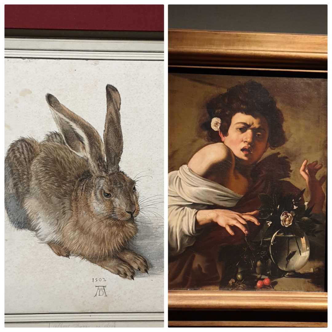
The quantity and quality of the Northern master’s works presented in this once-in-a-century exhibition just blew my mind. Most of us know “the Dürer Hare” but probably aren’t aware of the novelties he introduced to his contemporaries, and know little of his universality as an artist.

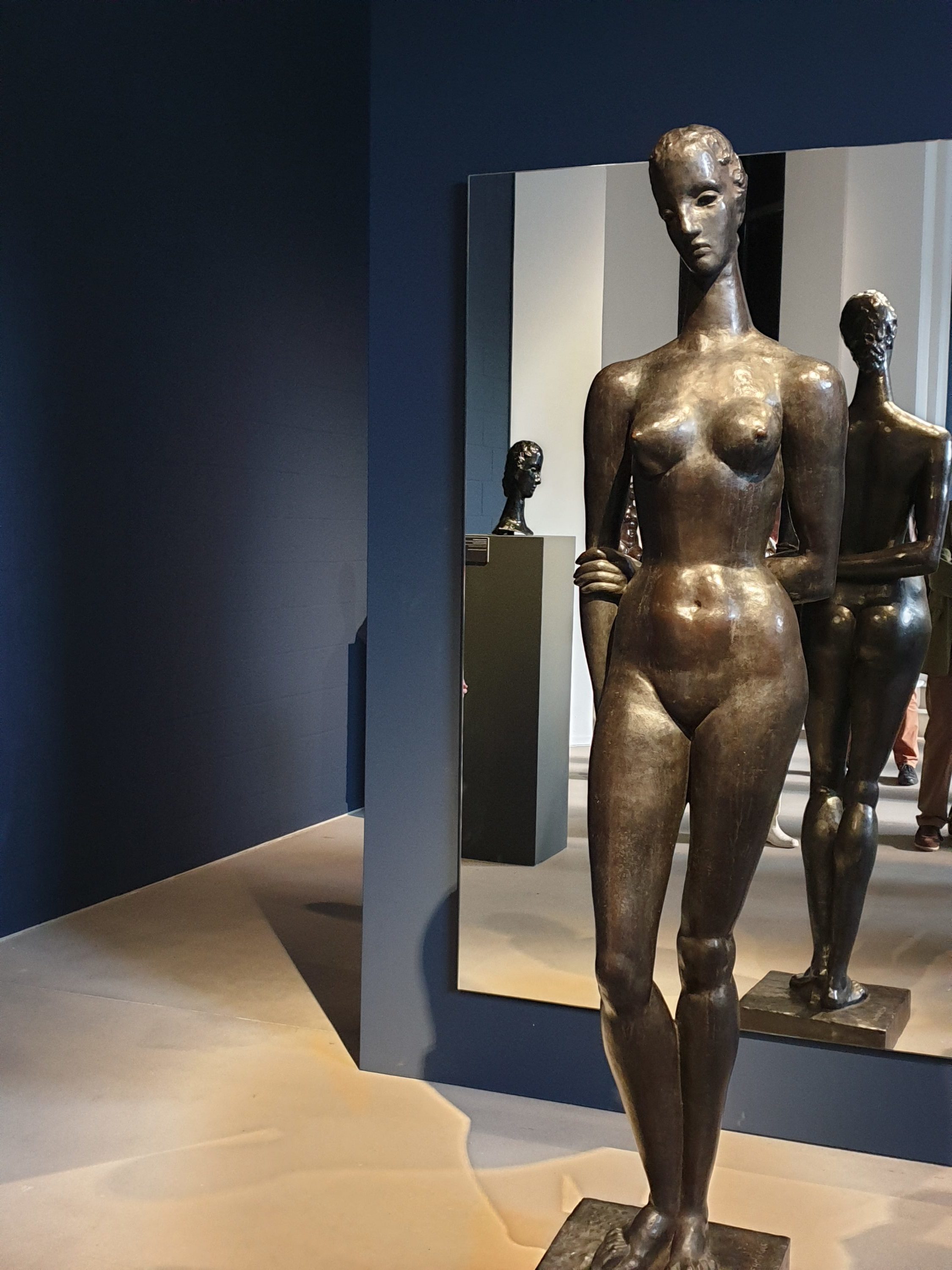
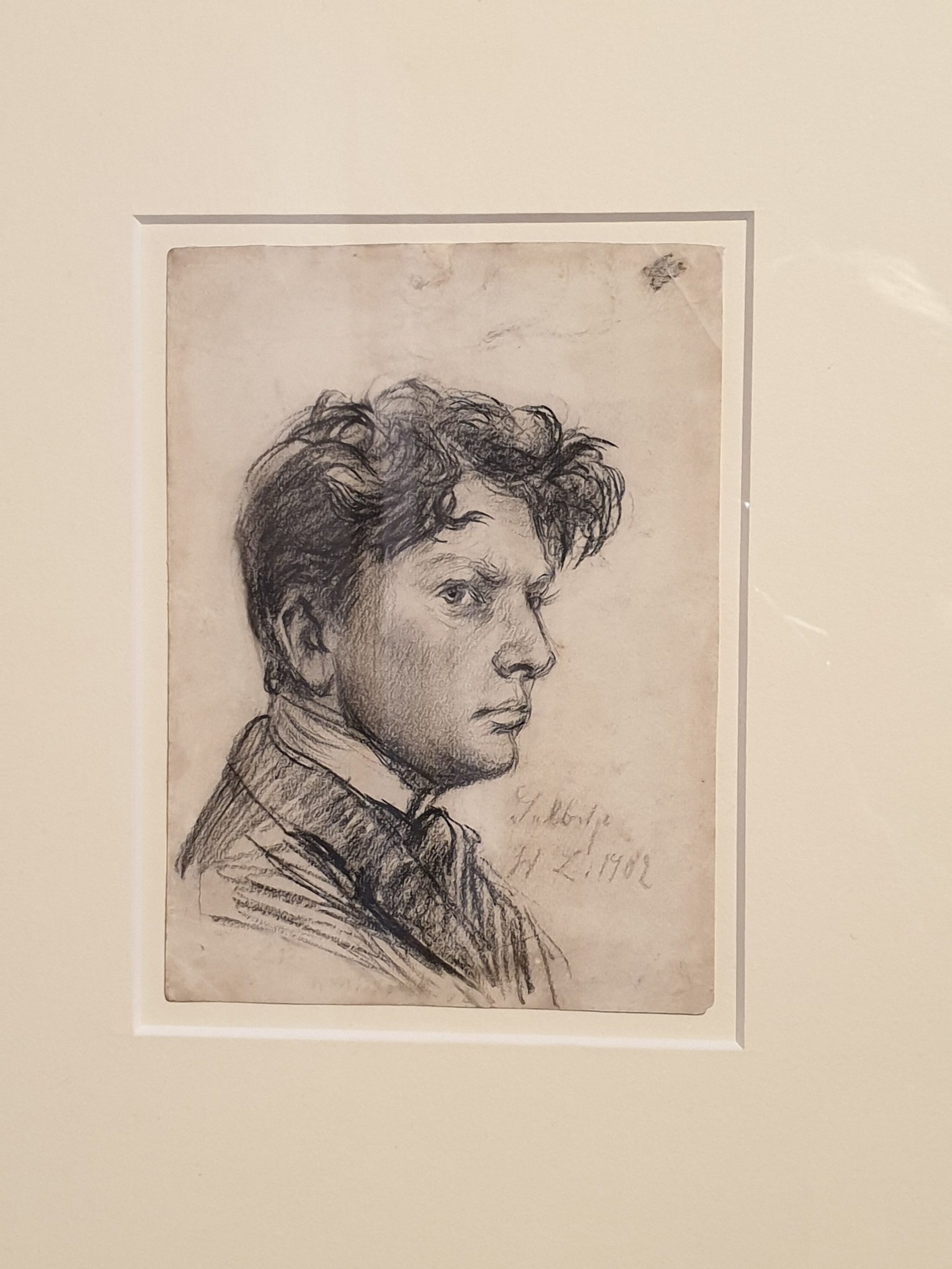
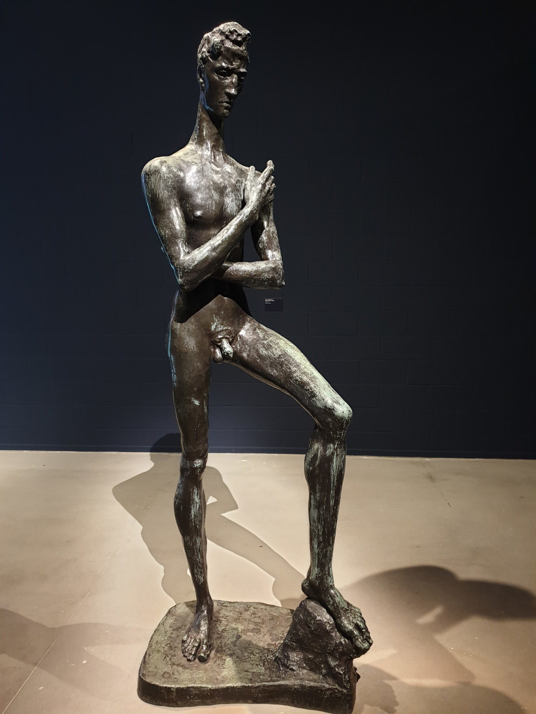
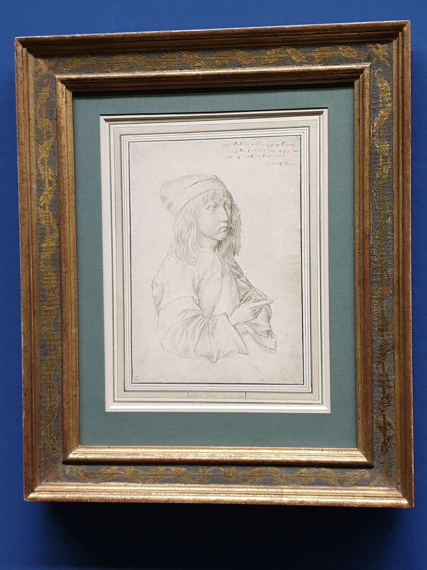
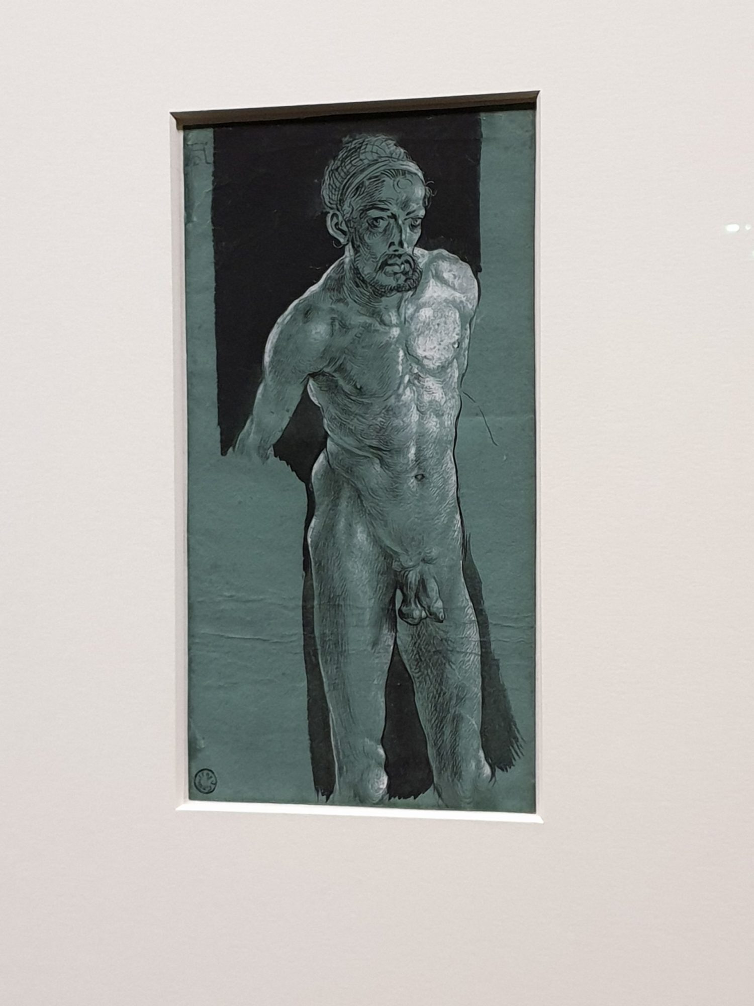
His artistic qualities struck me already when I viewed his Self-Portrait at the Age of Thirteen in 1484, which by the way is the earliest preserved children’s drawing. But when I saw his Nude Self-Portrait, painted around 1499 and unique for its time, for a moment I thought I was standing in front of a drawing made by Egon Schiele.

Albrecht Dürer, Self-Portrait at the Age of Thirteen, 1484, Silverpoint
Albrecht Dürer, Nude Self-Portrait, ca. 1499, Pen and brush, heightened with white, on green prepared paper

Self-Confidence And Early Branding

What is also striking is Dürer’s self-confident appearance in and through his works. He often drew an image of himself in his pictures and didn’t hesitate to depict himself as Hercules or even in a Jesus-like pose. Albrecht Dürer was the first artist of his time to use a signet on all of his works. It soon became a quality mark. He established a workshop at the young age of 25, which specialized in high-quality prints. Thus he was able to reach a wider public. Reading about the way he built up connections throughout Europe and branded his name, I started thinking, that networking was as important as it is nowadays back then.

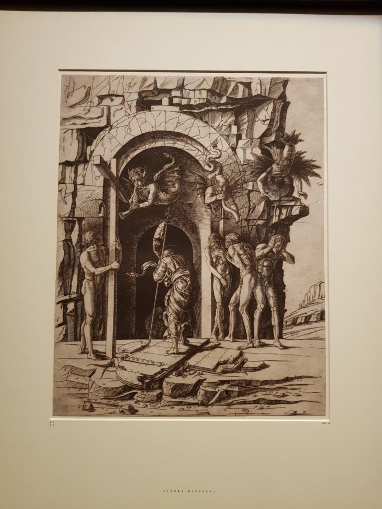
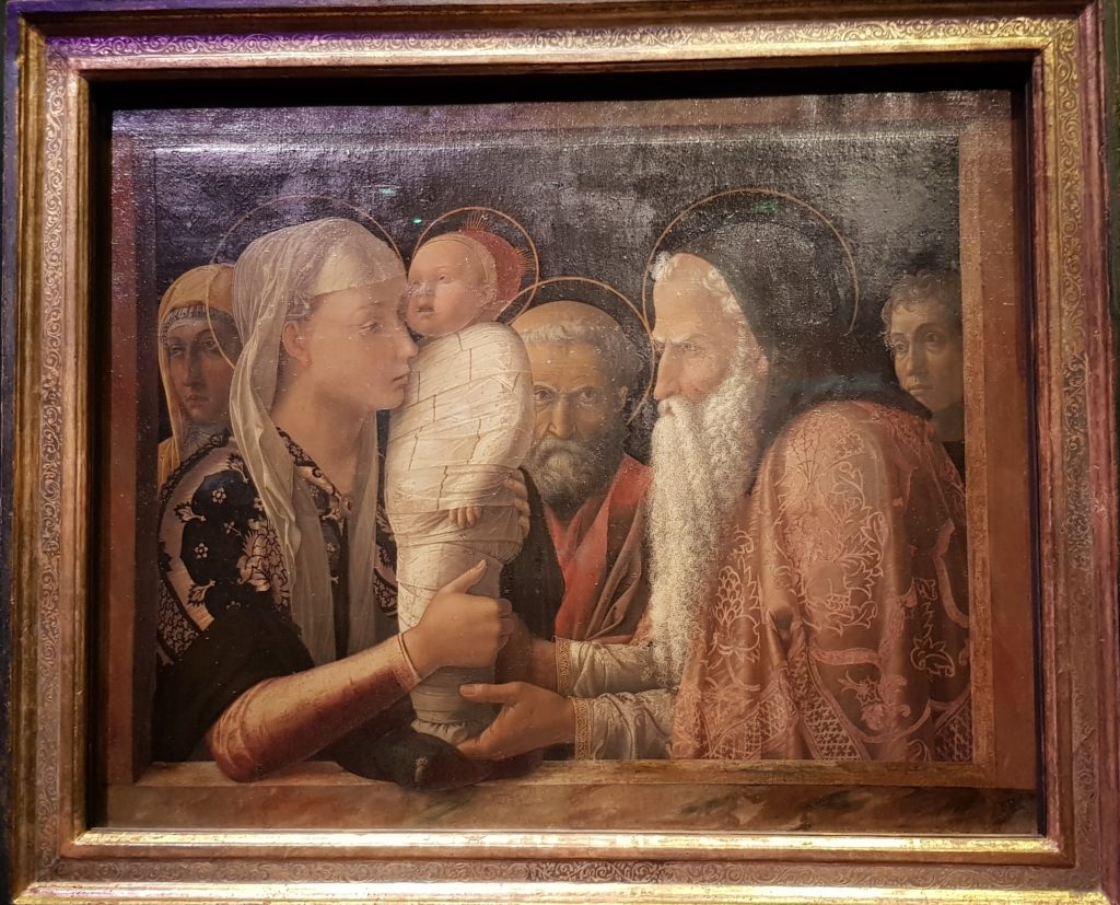
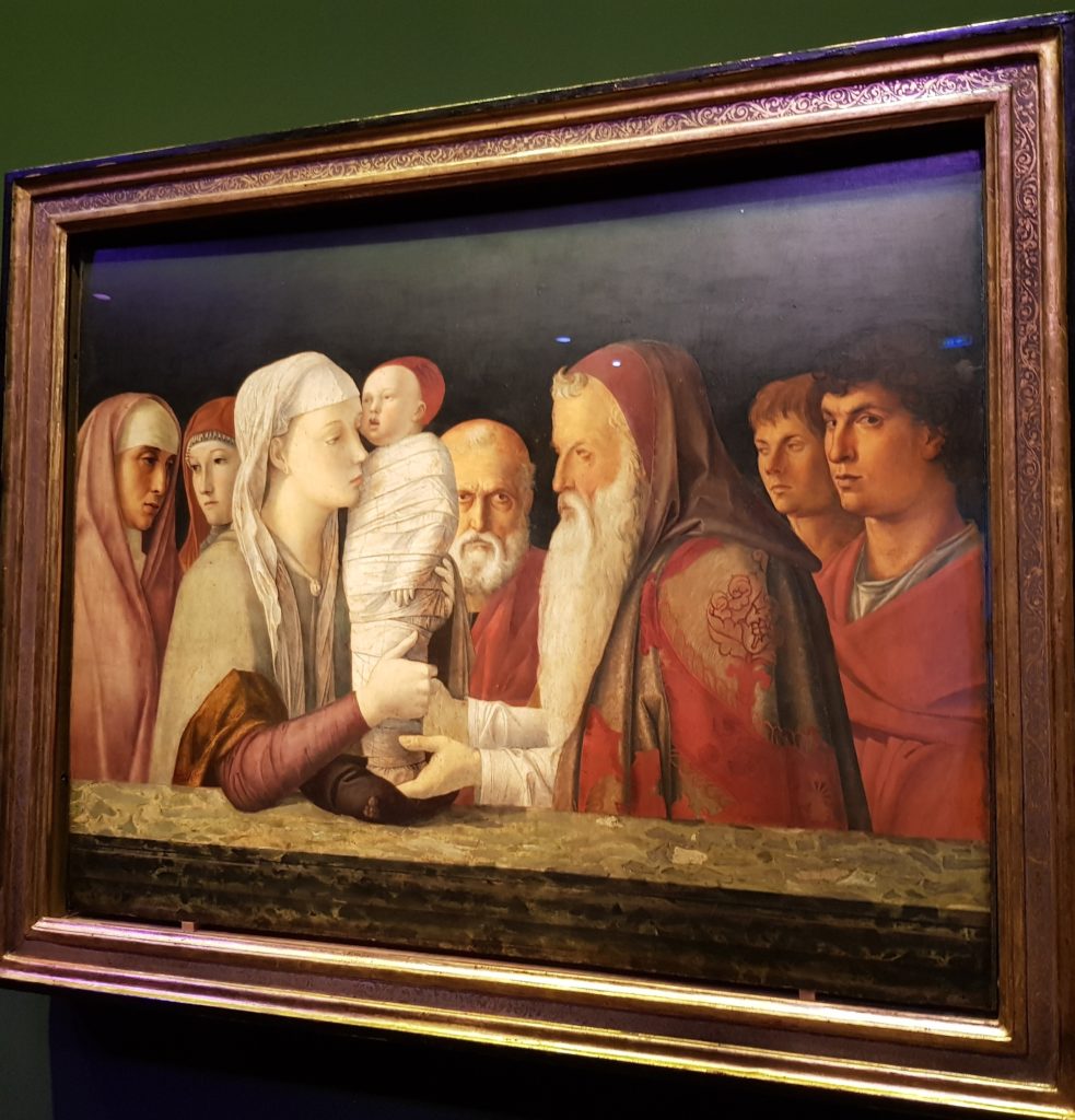
Dürer had made a journey to Italy in 1495, aiming to make contacts and start building up a network south of the Alps. Venice, the center of early book printing was of particular interest to him, and Andrea Mantegna, who marketed his works throughout Europe via a well-organized distribution network, his role model.

Andrea Mantegna, Battle of the Sea Gods, ca. 1470 – 1475, Engraving
Albrecht Dürer, Battle of the Sea Gods, Copy of Mantegna’s Engraving, 1494, Pen

Love Of Detail And Chiaroscuro

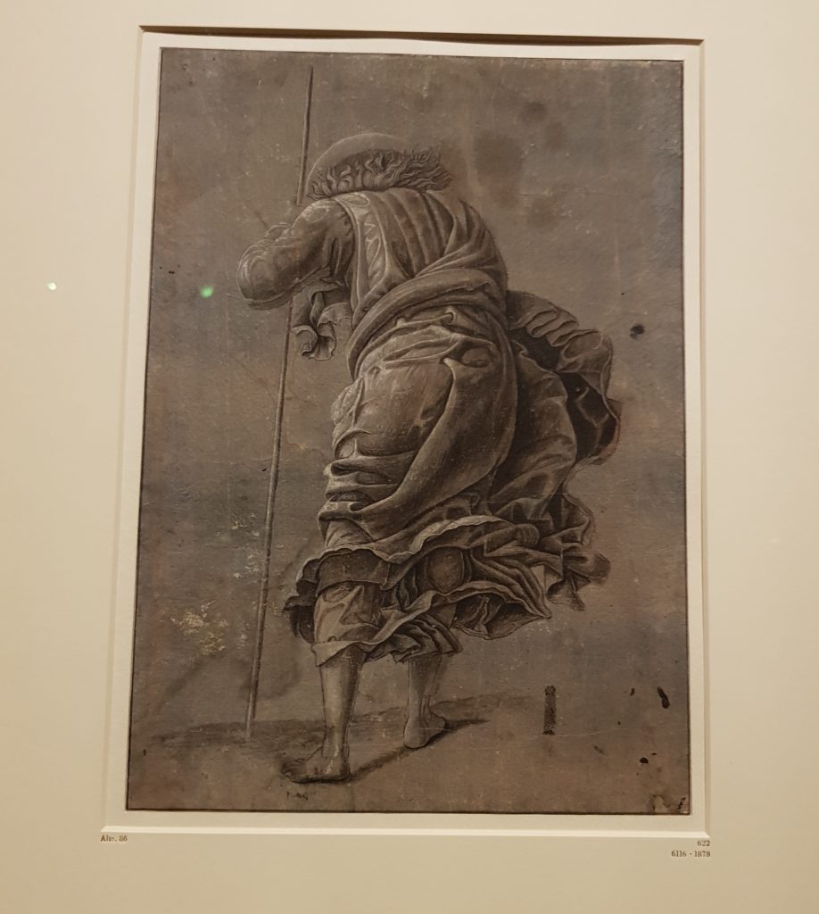
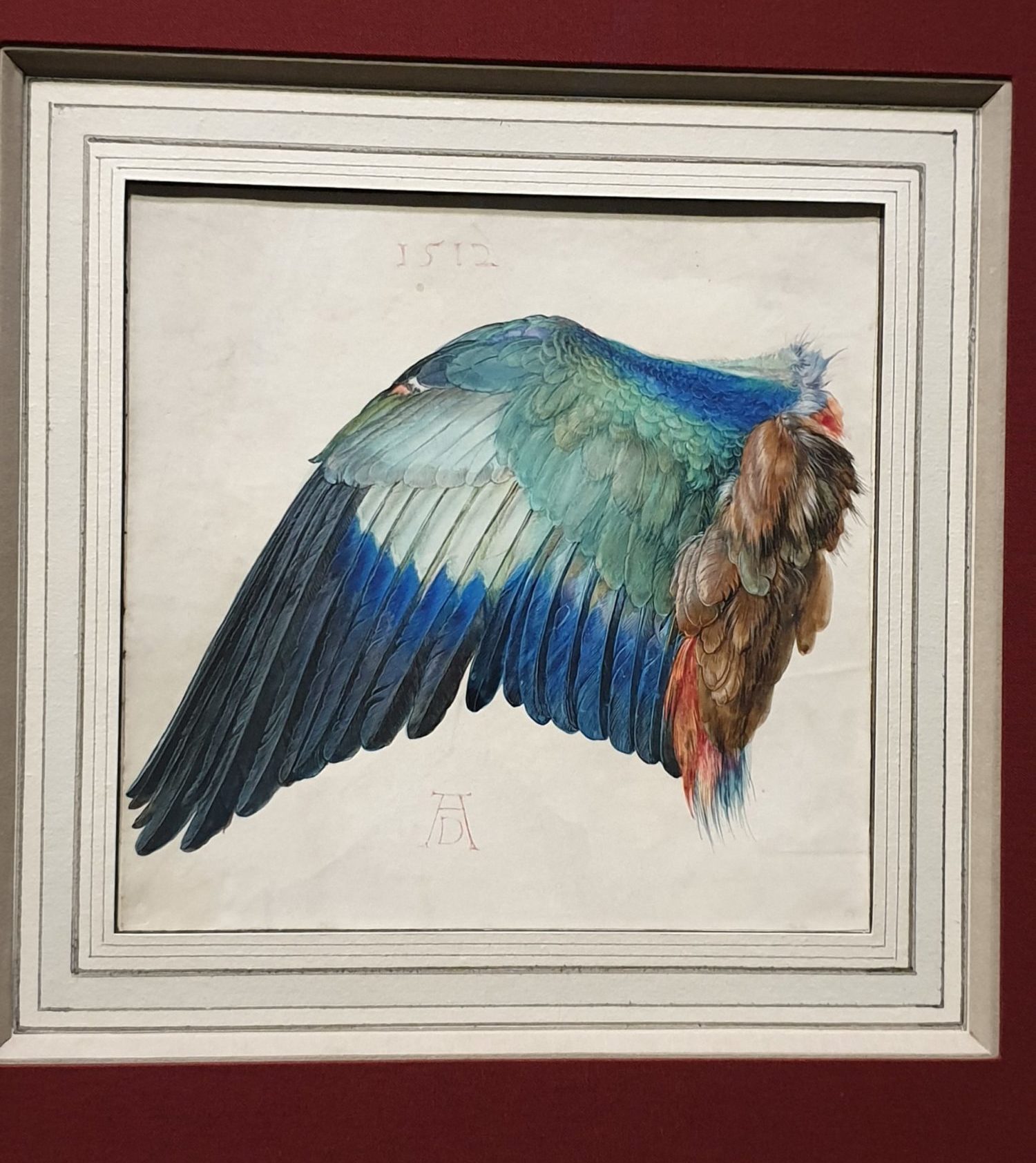
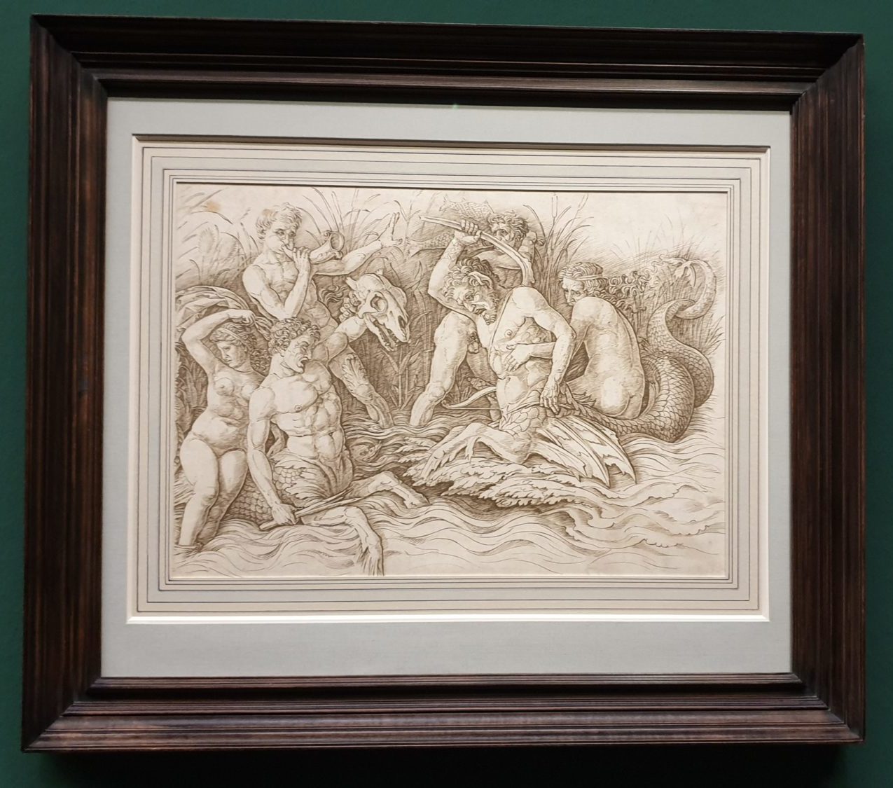
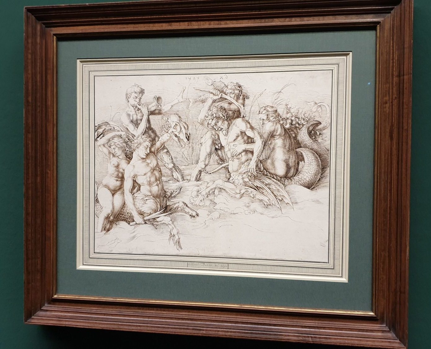
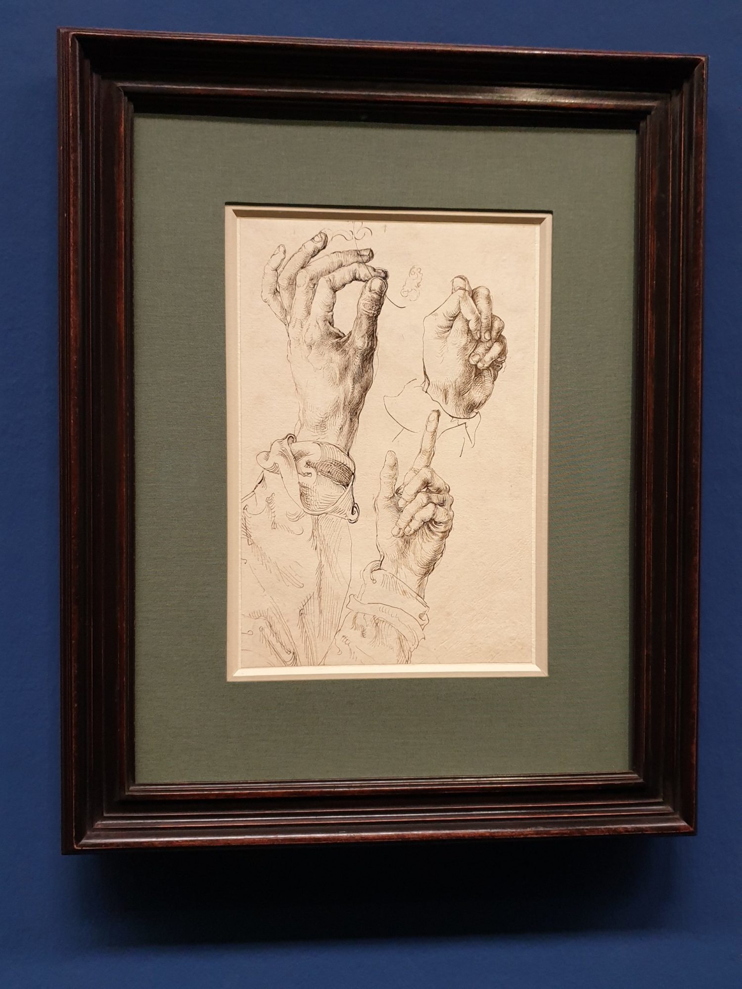
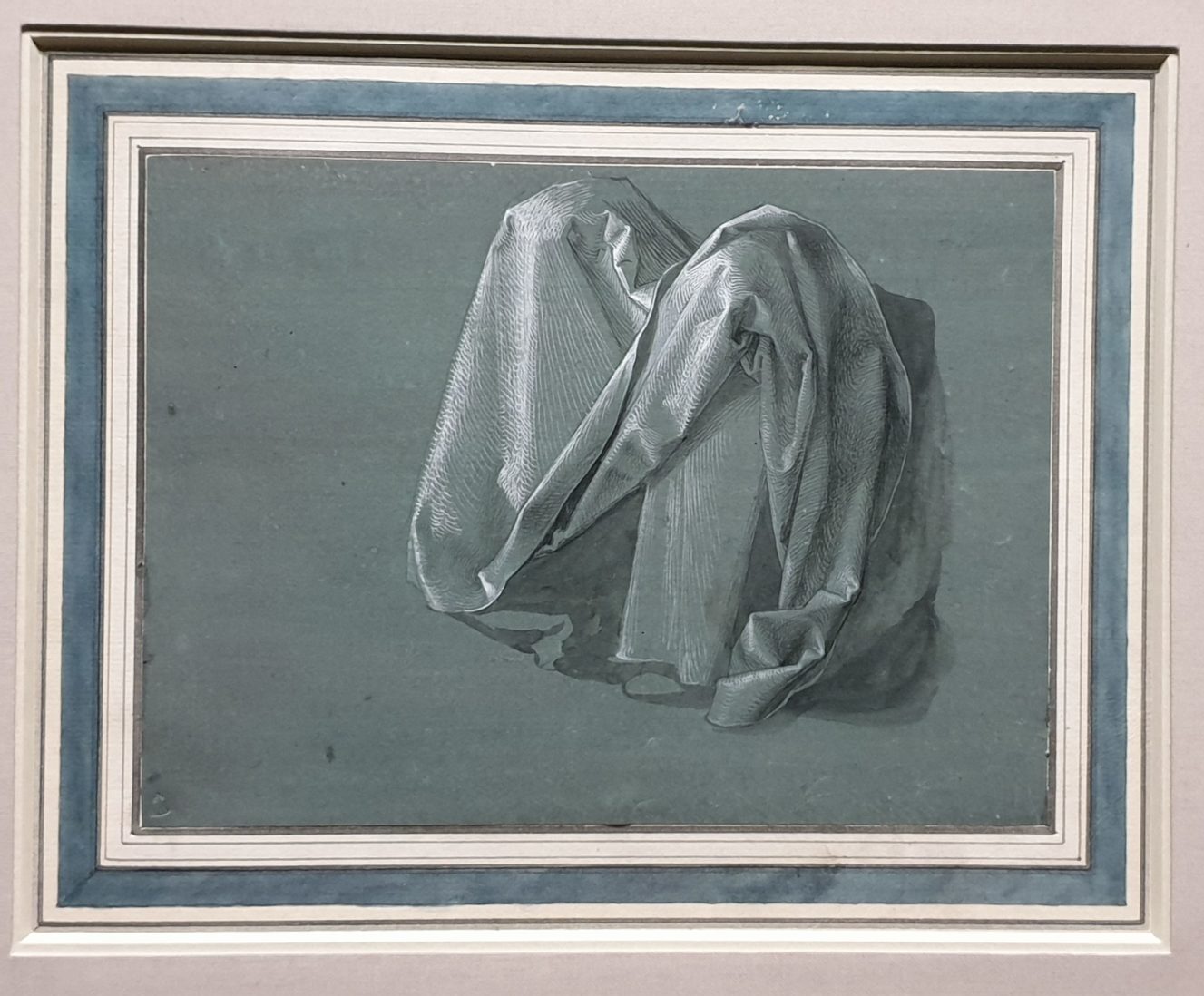
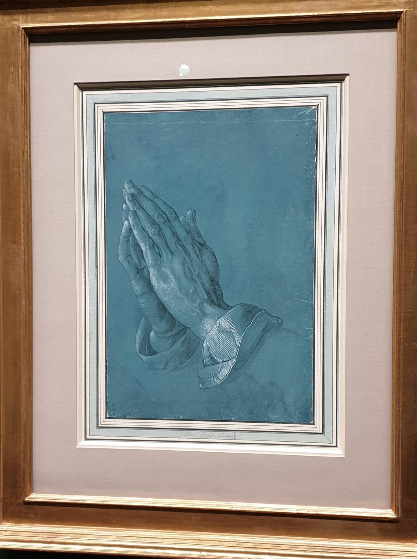
One could follow Dürer’s love of detail, as well as his artistry in depicting it throughout the exhibition. Using his extraordinary observation skills and making numerous studies, which could stand for themselves as outstanding works of arts, the German artist created world-famous masterpieces like The Hare and The Great Piece of Turf (both displayed in the exhibition). For Dürer the study of nature represented the foundation of art and included a meticulous observation of his own body, as seen in Three Studies of Dürer’s Left Hand.

Albrecht Dürer, Three Studies of Dürer’s Left Hand, 1493/94, Pen

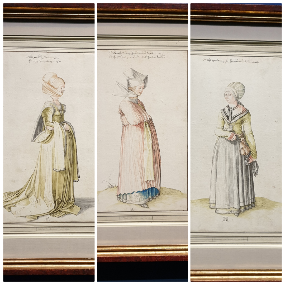
Dürer was a master of the depiction of such diverse materials as skin and hair, stones and plants, and also showed a great interest in a naturalistic depiction of garments and draperies. His costume studies include a four-part series showing women from Nuremberg dressed in different public and domestic costumes. Coming from a family of goldsmiths and having been a goldsmith’s apprentice for a while, he continued throughout his life designing pieces of jewelry and splendorous vessels.

Albrecht Dürer, Nuremberg Women, 1500, Pen, watercolor
Albrecht Dürer, Vestment of God the Father, 1508, Brush, heightened with white, on green prepared paper

The German artist masterfully played with “chiaroscuro“, the effects of light and dark, making his drawings and engravings profoundly three-dimensional, and thus very exciting and theatrical. By the way, in the person of Caravaggio, he found a major successor to his chiaroscuro-artistry.

Albrecht Dürer, The Praying Hands, 1508, Brush, heightened with white, on blue prepared paper
Michelangelo Merisi da Caravaggio, St Francis in Ecstasy, ca. 1595/96, Canvas


The Artist’s Lesser-Known Side

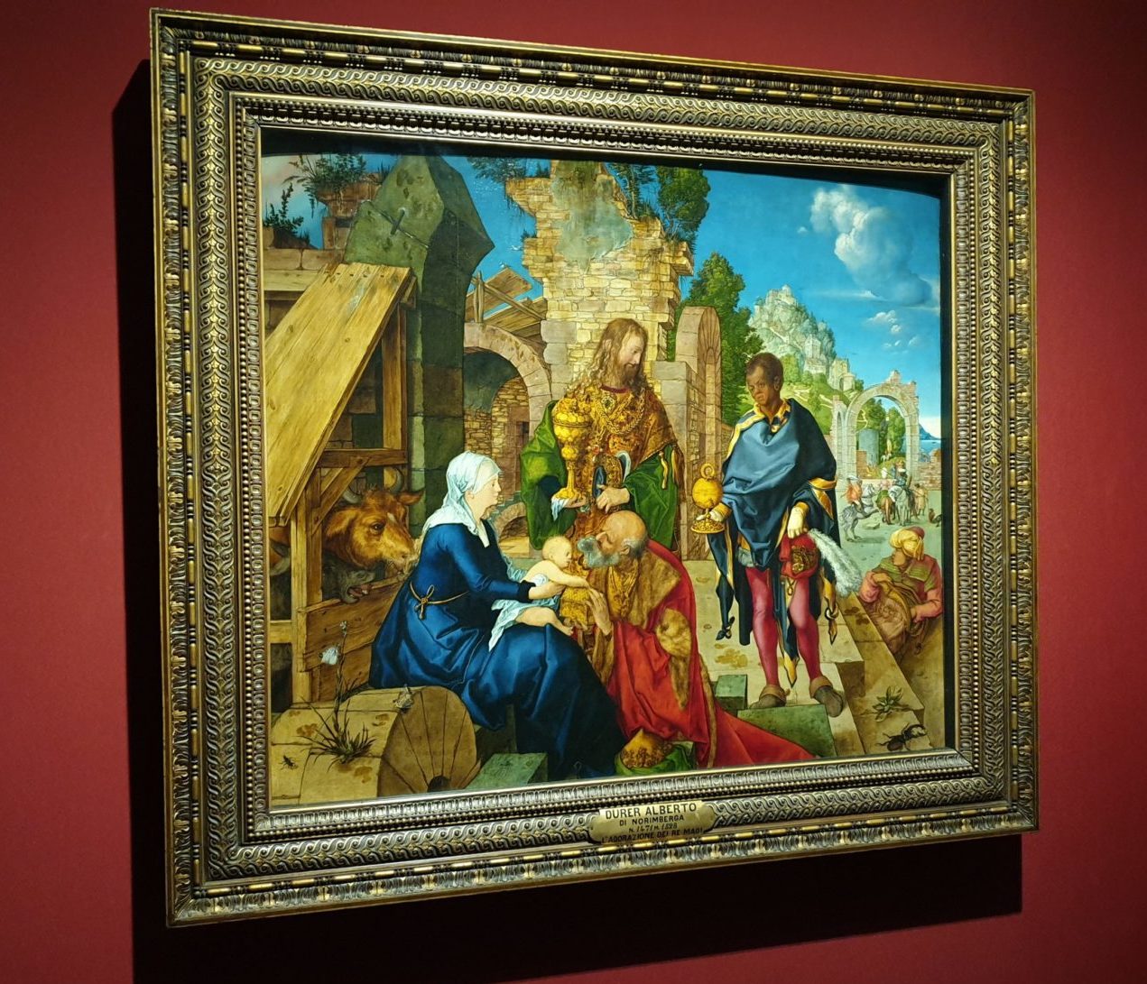
The exhibition didn’t forget to mention the fact that Dürer, who experienced early recognition or even stardom as a printmaker, was eager to be recognized also as a painter. After all, painting is the most prestigious discipline in the fine arts. It was very interesting to follow the big amount of detailed studies to the few displayed paintings, mainly consisting of altarpieces. But the paintings themselves did not arouse the same fascination in me as the master’s drawings and printmaking work. To me, they didn’t appear to be as equally “modern” and innovative.

Albrecht Dürer, The Adoration of the Magi, 1504, Oil on wood

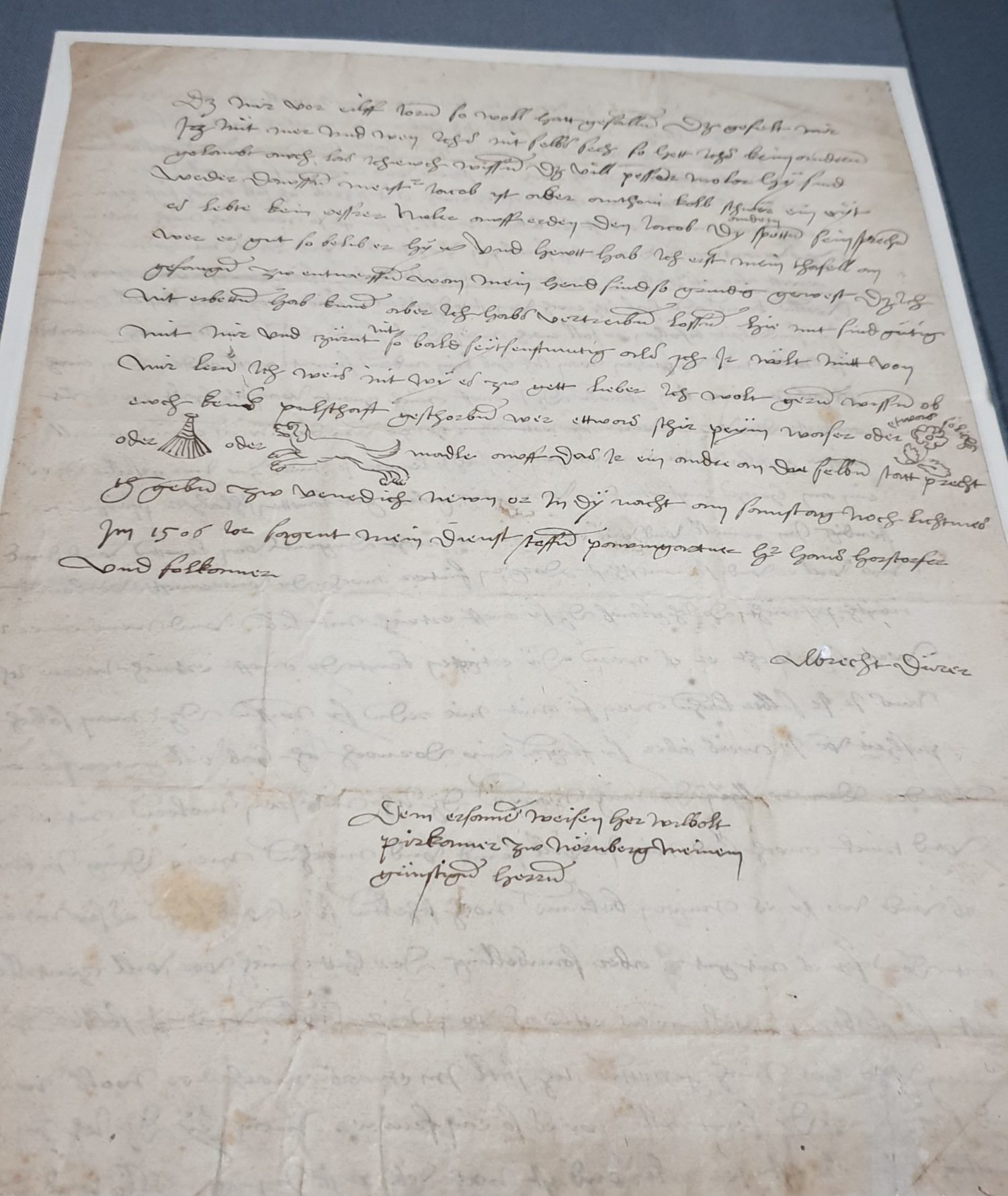
What I found more interesting because it brought me nearer to the artist as a “normal” human being, was a small curiosity on display:  a letter to Dürer’s Nuremberg friend Willibald Pirckheimer, in which the artist, after discussing different maters, inquires about the well-being of the addressee’s divers love-affairs, using encoded pictograms to characterize them.

Albrecht Dürer, Letter to Willibald Pirckheimer, 07.02.1506

Theoretical Work

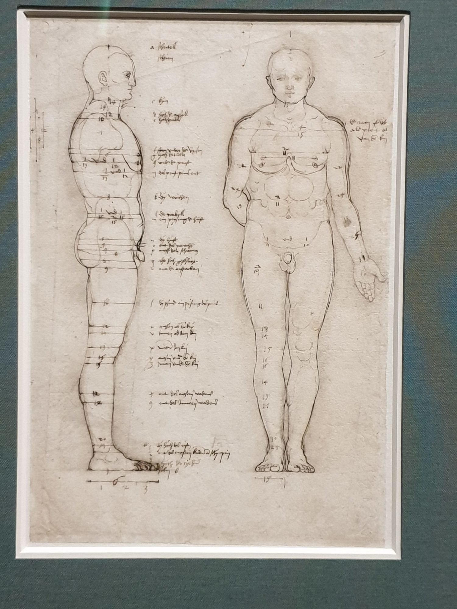
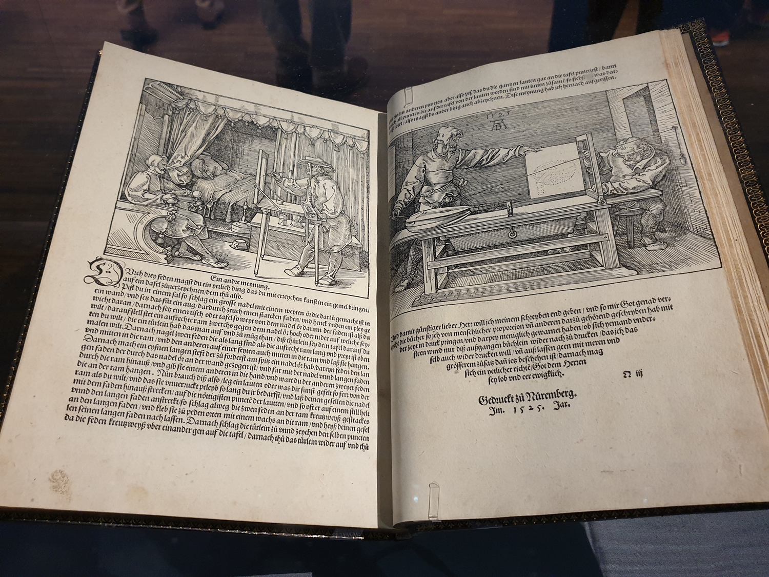
Finally, the show also pointed out Dürer’s dedication to his theoretical work in the last years of his life. The German artist was convinced that the knowledge of perspective was fundamental when training to be an artist and indispensable to an artist’s work. He tried to discover and establish the ideal human measurements following the ideals of Ancient Greece. And probably he even gave us an insight into his working methods with his illustrations of A Man Drawing a Seated Man and A Man Drawing a Lute.

Albrecht Dürer, Study in Human Proportions: Male Body, Side and Front View, ca. 1513, Pen, black chalk
Albrecht Dürer, A Man Drawing A Seated Man and A Man Drawing A Lute, Illustrations in The Instruction In Measurement, 1525, Woodcut and type printing


Anthony van Dyck in Munich

Anthony van Dyck

Last weekend I spent a couple of hours in the newly renovated Alte Pinakothek in Munich. This time not to see their permanent rooms but a special exhibition of Anthony Van Dyck’s work. As I sat in the cafeteria afterward, I pondered over the fact that although this was not the big retrospective show with highlights from London or elsewhere, it was an excellent exhibition. And it seems fitting that after seeing and writing on this blog about the big Bernard van Orley and the Mantegna-Bellini retrospectives I should now write about an exhibition of a great portrait artist (see my Alex Katz write up for more portraits discussion) which is not a retrospective.

Who is Anthony van Dyck?

Anthony van Dyck (1599-1641) was a Flemish painter from Antwerp renowned for the painting of portraits. The seventh child to a wealthy silk merchant, his painting abilities were obvious at an early age. One of his first important influences was gained by working in Peter Paul Rubens’s workshop, close to the master so to speak. His trips to Italy in the 1620s were, however, the turning point in finding his style following his study of Titian (Tiziano Vecellio) and Tintoretto. After becoming a court painter in Flanders to the archduchess Isabella, Habsburg Governor of Flanders he returned to England in 1632 following a request from Charles I to be the main court painter there. Most paintings from this extremely rich period are still part of the huge Royal Family Collection in London.

Van Dyck at the Bavarian State Painting Collection

The paintings we see here belong mainly to the Bavarian State Painting Collection. The collection was built by two Wittelsbach family members in the 17th century and has been in Bavaria ever since. In 1628 Wolfgang Wilhelm, Count Palatine of Neuburg (1578-1653) commissioned Anthony van Dyck a portrait of himself, thus starting the first connection with the artist. His Grandson, Johann Wilhelm, Elector Palatine of Neuburg (1658-1716) later began a collection of 30 works by the painter. His cousin Maximilian II Emanuel, Elector of Bavaria (1662-1726), in many ways his rival, collected 51 works by the artist. Twenty-three of these originally acquired works by the Wittelsbach dynasty, are considered full original autographs by Anthony van Dyck.

The use of the workshop

It has been discovered over time, and especially with new scientific studies on the paintings, that what is assumed to be by Anthony van Dyck is not always fully by him. In those days, a workshop was absolutely vital for any serious artist. After all, van Dyck had also started out as one of Rubens’ workshop artists, before gaining his own reputation. So, how did it work? Well, those willing to give the highest sum got the whole van Dyck package, those paying less got the hands or more features painted by one or more of the artists from his studio. The basis for pose, heads, horses, hands were all catalogued on study sheets and paintings done by the master.

This is wonderfully displayed in this exhibition. Study heads paintings, for instance, occupy a whole wall. Most of these have been separated to create 2 or more paintings, making it more profitable to sell, some are still whole. How these study heads have been painted is being explained and shown here not only with informative texts on the wall but also very excellently with the help of an electronic info-table.

Subtle, yet very informative boards


What I particularly liked is that there are only a few such tables in the exhibition. They bring a wonderful insight by showing details of the paintings and accompanying them with explanations about the making of the works in the rooms. Yet, they do not overtake the exhibition. They are subtly set, are not interactive, so as not to disturb the more important viewing of the actual paintings. They remain just factual help. This information is in part the result of recent scientific work on the paintings from the house collection, triggering the impetus for presenting this exhibition.

Rubens versus van Dyck

Drunken Silenus, c. 1617/18 additions c. 1625, Peter Paul Rubens

Peter Paul Rubens was in many ways the artistic “father” of Anthonis van Dyck. Yet, his psychological approach to portraiture sets him apart from Rubens. It is obvious here that Rubens is all about big monumental figures, about representative paintings, whereas Van Dyck is about the emotions, the human being, the psychology of the person painted. In “Drunken Silenus” which both artists painted in 1617/18, in Rubens’ case with an additional bottom section in 1625 to make full figures, we can see this very clearly. Van Dyck paints an old man, not able to walk alone anymore because of his drunken state, Rubens, on the other hand, paints a strong Silenus, more of an allegorical painting.

Drunken Silenus, c. 1617/18, Anthony van Dyck

Titian

Nicely shown here is also the connection with Titian. During his trips to Italy, van Dyck studied Titian amongst other Italian artists closely. Titian, for instance, portrayed cherubs and his baby Jesus larger than life, very big in shape. Van Dyck decided to experiment with that too in his Madonna and Child paintings.

The full-length portrait format used by Titian is another factor influencing both Rubens and van Dyck. An example of the 3 artists side by side shows this very clearly.

Emperor Charles V, 1548, Titian

Titian’s portrait of Charles V from 1548 sets the standard, with its full format and its background, for the next generations to come. Next to it, following Titian’s example, is the huge representative painting of Rubens dating of 1620 of Aletheia Talbot, Countess of Arundel.

Aletheia Talbot, Countess of Arundel, 1620, Peter Paul Rubens


And completing this series is the more personal full portrait by van Dyck of Sebilla Vanden Berghe from 1630. Here he shows his greatness in capturing the aura and personality of his sitter.

Susanna Fourment and her daughter Clara del Monte, 1621, Anthony van Dyck

These 3 paintings belong to the Bavarian State Painting Collection, as are most paintings presented in the exhibition.

So, is this just as good as a retrospective?

What makes this exhibition so special for me, is the fact that it gives us a wonderful insight into how van Dyck worked. It presents how important the workshop was to the artists of this period, how van Dyck produced such gorgeous masterworks, how artists connected and influenced each other and how van Dyck’s portraiture sets him apart from other artists. One doesn’t always need the highlights from other collections to make an exhibition special. I didn’t miss the paintings from London or from Vienna here. Fittingly the exhibition ends by talking about the start of van Dyck’s London paintings, not by showing a portrait from that collection but with a house painting by a later English great portraitist to represent this: Thomas Gainsborough.

This exhibition is a wonderful opportunity for the Bavarian State Gallery to show off its great collection of van Dyck paintings. It allows works to be placed side by side, some not always on view showing very clear parallels between the artists.  Together with the few “guest” works, it gives a wonderful insight into van Dyck’s work and legacy. In my eyes, a wonderful show, well worth the visit!


How necessary is Art? My thoughts after a week in Madrid

Having just come back from a successful and inspiring week in Madrid I can’t help thinking about what I experienced there. And by doing so, I am faced with a wonderful maybe unanswerable question: why is art so powerful? And furthermore: is it, that by touching an inner nerve art reminds us of what really matters? It isn’t that I don’t know how strong an artist can be, but perhaps amidst all the activities and impulses one is confronted with daily, one tends to forget just how important art’s impulses on us are…

Unexpected exhibition

Refuel Meal, 1996, Tetsuya Ishida, acryl on board

On my first day in Madrid, I experienced such a moment. Purely coincidently, I happened to walk through the Retiro Park and discovered the Reina Sofia‘s external exhibition space, the Palacio de Velázquez. After admiring the building and taking a few photos, I walked in, not knowing what to expect. A most fascinating exhibition of, an unknown to me, Japanese artist was being shown: “Tetsuya Ishida, Self-Portrait of Other“.

Not expecting anything, I observed the inside of the building first.  It is a beautiful, very bright and open space… perfect for exhibitions. Then, I started looking at the paintings. Very quickly, I felt disturbed by them. Who is this artist? Why do I get the feeling that the men being portrayed are machine-like human beings? Always the same person, sometimes alone sometimes as a series… More and more I started to reflect and understand that this is what our society is becoming. Men turning into producing machines, men being lost, men in search of their identity… Where has life gone? Questions upon questions springing to my mind…

Hothouse, 2003, Tetsuya Ishida, acryl and oil on canvas

Some paintings were so disturbing I first had to walk away to come back to them later. This artist touched a chord in me, moved something in me so that when walking out in the bright sunshine I was a little dazzled and first had to sit on a bench in the shade before moving on.

Zarzuela magic

A few days later during the dress rehearsal of Doña Francisquita at the Zarzuela Theater in Madrid, I experienced a different powerful moment. A dear friend of mine had managed to get us tickets, knowing that I very much wanted to see a Zarzuela. I had never seen one before and was very curious and excited to discover this typical Spanish Artform. What a wonderful evening it turned out to be. The theatre itself is a jewel, and the music by Amadeo Vives is lively and fun, the piece was premiered in 1923, using a big orchestra with a large guitar section added to it.

The highlight came when the Fandango, probably the most famous dance in this Zarzuela, was about to happen. We had already sat through most of the piece having enjoyed some beautiful singing, some laughter, and some flamenco dancing.  Now, in the 3rd Act, one of the protagonists suddenly came up front and spoke to the public directly explaining that the “Maestra” was here and that, totally unexpectedly, she had agreed to play for us the Fandango. My Spanish friend knew straight away who was meant, and was totally in shock and excited as Lucero Tena walked in and stood at the front of the stage waiting for the orchestra to start playing.

Lucero Tena is a legend, and I, although not knowing her until then, quickly found out why. She is now over 90 years old, and even if she doesn’t dance anymore, she most certainly plays the castanets like nobody else. The music she produces, the colours, the dynamics, the expression, the presence is absolutely breathtaking. As I sat there, I just could not believe what I was hearing. The whole audience just went crazy, and the 6 dancers who straight after danced, with their own castanets, the same Fandango, were so energized you couldn’t help but be fully taken in. Incredible!

Personal experience

The last experience I had which reminded me of the power art has, is probably the most personal. Of course, I wasn’t in Madrid just to visit, although that would be a good enough reason to go there. I was also there to perform. It turned out to be a very special performance, as this was also a present for a dear friend of mine’s birthday.

As a musician, one is very much busy thinking about this note or that rhythm, about this sound or that expression, this being together and that tempo… When the performance comes, it is necessary to let it all go, so that the performing can take place. Being an opera singer, I possess a certain amount of stage presence and acting ability. However when singing Lied, such as the Wesendonck Lieder (Richard Wagner) here, the acting becomes unnecessary, the music and especially the text are the most important.

On this evening, when singing “Träume” (the last of the cycle) I became aware of the power of my instrument and of my artistry… It is as if one touches the listener’s inner self through something unexplainable, one moves something inside… One feels the concentration, the silence, the strong emotions coming back from the audience, and really one can’t say how it happened… Quite magical really. And then, when public and performer join in a time of mutual silenced thanks after the last sound has rung, you know that you, as an artist, are important just for that.

Afterthought

Maybe I had, with all my little worries or stresses forgotten how vital and necessary my job and artform is. Not just as a performer, but also as a person. Today’s hectic competitive life often doesn’t allow us to remember this enough. But really without art, we become machines… just as in Tetsuya Ishida’s paintings. Maybe that is why these paintings were so disturbing and moving for me. It is vital to have such artists, reminding us of what is important: being a human being who feels and not a machine which produces.

Lost, 2001, Tetsuya Ishida, oil on canvas


Lehmbruck And Rodin In Duisburg – Sculpturing A New Idea(l) Of Beauty

On the occasion of artists’ round birthdays and anniversaries of deaths, museums put on commemorating exhibitions. Since I started writing for this blog, I was lucky enough to happen upon three of this kind (see my posts Death in Trieste and Insights into Bruegel).  Every one of these shows helped me widen my horizons a little bit more and sharpened my observational skills.

An Easter Surprise: Lehmbruck And Rodin In Duisburg

This was especially the case with the exhibition I visited during the Easter holidays, not far from home. Not only did I get the chance to meet again with the work of a favorite artist of mine, Auguste Rodin (1840-1917), but at the same time I discovered a prominent sculptor I wasn’t at all familiar with, Wilhelm Lehmbruck (1881-1919). Happy to have come across this important German artist nearby, I went back another time a few days later.

On my first visit, I joined an exclusive guided tour offered by the TV-cultural magazine Westart. Their small, informative TV-report on the exhibition had made me curious. Besides, it is always exciting to win something. The art historian, author, and filmmaker Jörg Jung showed us around. By raising questions, he drew our attention to the similarities and, above all, the differences between the two outstanding artists. He invited us, again and again, to take a closer look and make our own discoveries and conclusions.

Taking a closer look at Wilhelm Lehmbrucks Pensive Woman, Bronze, 1913

Learning To Look Closer

Thus encouraged, I noticed, for example, what difference the choice of material makes and how a sculpture’s more or less smooth surface makes it more or less classical in an academic sense. Auguste Rodin, in particular, loved to work very physically with his coarse hands, giving many of his works sensual movement and an unfinished impression. Wilhelm Lehmbruck, on the other hand, experimented a lot with different materials and worked towards carving out more introspection and spirituality in his objects. Both artists played with sculpture excerpts and torsos, always in search of “the essence”.

Sculpture is the essence of things, the essence of nature,

that which is eternally human.

Wilhelm Lehmbruck


Beauty is not a starting point, but a result;

beauty exists only where there is truth.

Auguste Rodin

Studying The Past Before Creating A Personal Style

Our guide also drew our attention to the little innovations by which one can identify a young artist aiming to break with traditions, such as the undisguised body curves and folds in Lehmbruck’s first success, Bathing Woman (1902/05). The Academy of Fine Arts in Dusseldorf bought this work from its young master student and thus enabled him to go on a study trip to Italy. There he studied, among others, the works of Michelangelo, one of the greatest sculptors of all times. Michelangelo had also been a great inspirational figure for Rodin.

Wilhelm Lehmbruck, Bathing Woman, Bronze, 1902/05

In general, art lives from the fact that artists study the past, learn to analyze it and develop their own style over time, depending on their talent and nature, as well as their environment and the time they happen to live in. All artists get to chose their subjects from the great basin of art iconography. We thus can admire how differently a story can be interpreted and cast or shaped into form.

But Who Was Wilhelm Lehmbruck? And What About Auguste Rodin?

Wilhelm Lehmbruck was born in 1881 to a coal miner’s family in a suburb of Duisburg. Not only was his talent discovered early, but he soon became a master student of the Academy of Fine Arts in Dusseldorf. He celebrated early successes that allowed him to live from his art, as well as to travel. One of his first travels led him to Paris, the capital of art at the beginning of the 20th century, where he couldn’t but visit the atelier of his idol, Auguste Rodin. But he immediately realized that he was looking for something else in art. Maybe Rodin and he were too different as human beings?

Wilhelm Lehmbruck, Self-portrait, 1902

Auguste Rodin, born in Paris in 1840, obtained his craftsmanship by working as a stucco plasterer and decorator after having being refused admission to the sculpture class of the Paris Academy of Fine Arts three times. His approach to art seems to have been very intuitive and sensual, probably very much like his personality. Fascinated by the new medium of photography, the French artist, who wasn’t much of a reader, tried to capture movement, casting it in marble or bronze. He was a workaholic, who liked recombining parts of already existing works, thus revealing new contexts.

Auguste Rodin, I am Beautiful, Bronze, 1885, an example of Rodin’s Assemblage technique

More On Lehmbruck

Lehmbruck had a much more academic upraising despite his family’s working-class background. As if he knew, that his life wouldn’t last long and more of a rationalist as a person, he quickly detached himself from every young artist’s role model of that time, Rodin. The German artist, inspired by Plato’s ideology of soul over body, worked on finding sculptural solutions for the world of ideas, leaving the depiction of naturalistic bodies behind. He stretched the body parts of his figures, thus making them thin and somehow disproportional, but strong in their contemplativeness and resignation.

All art is measurement.


Wilhelm Lehmbruck


Wilhelm Lehmbruck, Rising Youth, Bronze, 1913/14

Of course, knowing that the artist put an end to his life at the early age of 38 one tends to see melancholy and sadness in his so introspective works. But shortly before and during World War I. the world seemed to be coming to an end and one can understand that a sensitive artist might not see any future. Lehmbruck expressed his feelings of despair in the poem Is There Anybody Left?, written in 1918, one year before his suicide. He had anticipated the content of this poem in his equally expressive sculpture Fallen Man in 1915 as a reaction to the city of Duisburg’s invitation to join the competition for a war memorial.

Wilhelm Lehmbruck, Fallen Man, 1915

Two Very Different Thinkers

The differences between the two artists couldn’t be more obvious than in Rodin’s The Thinker and Lehmbruck’s Seated Youth, also named The Friend or The Bowed One by himself. Whereas Rodin’s famous incarnation of Dante Alighieri shows a pensive, but virile man who looks like a boxer (in fact the actual model for this sculpture was Jean Baud, a price boxer, and wrestler), Lehmbruck’s sculpture displays a young naked man, sitting with his head down in grief and despair. Once again, the anatomy is reduced, elongated and abstracted.

Auguste Rodin, The Thinker, Medium Model, Original Size, Bronze, 1881/82


You see, this is my conception of a thinker. Rodin’s “penseur” is as muscular as a boxer… what we Expressionists are looking for is to precisely extract the spiritual content from our material.

Wilhelm Lehmbruck to Fritz von Unruh


Wilhelm Lehmbruck, Seated Youth, Bronze, 1916/17


The Second Impression

Just a few days after my first attendance at the Lehmbruck Museum, I visited it again. I wanted to read the explanations (which also talked about the Paris Salon and the Armory Show, the first great exhibition of modern art in the United States of America in 1913) and look at the exhibits calmly, taking time to take them in and reflect on them. Going through an exhibition on your own a second time after having taken a guided tour, rounds up the experience.

Auguste Rodin, The Age Of Bronze, Bronze, 1877 staged in the context of the Paris Salon
Wilhelm Lehmbrucks Kneeling Woman (Bronze, 1911) staged in the context of the Armory Show

I also needed to experience this museum once again, as a whole and in each of its three wings separately. It was built in 1964 mostly as a home to the oeuvre of Wilhelm Lehmbruck by his son, Manfred Lehmbruck (1913-1991), an expert in the field of museum architecture. The part consecrated only to the works of Wilhelm Lehmbruck has a sculptural aspect itself. Build around an atrium as a central source of light, it gives the exhibited sculptures a “feeling of security”. The architect made miniature copies of his father’s works so as to be able to position them in a targeted manner in the space he created especially to showcase them. What a wonderful tribute from a son to his father.

Manfred Lehmbruck, Lehmbruck Wing Model with 38 models of Wilhelm Lehmbrucks sculptures

Is this beautiful?

The Lehmbruck Museum’s exhibition entitled “Beauty. Lehmbruck & Rodin. Masters of Modernism.” opens up a dialogue between the two masters of modern sculpture. It shows how they both had a big impact on their contemporaries as well as their successors. By displaying the history-making works of Rodin and Lehmbruck in the midst of the works of their expressionism colleagues one realizes that both masters of early modernism found ways of bringing out the soul and emotion of their figures without, in most cases, completely leaving the forms of classicism. But their sculptures subtly break with the conventions and visual expectations of the late 19th century and thus point the way to modernism. The question “Is this beautiful?” goes hand in hand with subjective perception on one side, and the beauty ideal of each time period on the other, and thus remains unanswered.

Wilhelm Lehmbruck, Kneeling Woman, 1911

My two meetings with Rodin and Lehmbruck gave me moments of beauty and contemplation. But I’d like to end this article with a personal highlight of this exhibition, Camille Claudel’s The Waltz. Like Maurice Ravel’s also La Valse entitled choreographed poem (1906-1920), it captures for me in a fascinating way the tormented spirit of the Fin de Siècle which ended in the world and art transforming Great War.

Camille Claudel, The Waltz, Bronze, 1889-1905


Camille Claudel, The Waltz, Bronze, 1889-1905


El Anatsui: Triomphant scales

An exhibition off the beaten path at Haus der Kunst in Munich.

I recently discovered this artist and his incredible work. A discovery that does not leave indifferent, quite on the contrary.
First of all, the facade of the museum is completely covered and transformed by the hand of the artist. This already triggers my curiosity.

Once in the Haus der Kunst, we enter the first room and immediately we have the impression that a huge majestic drapery fell on the wall.

We turn our heads to the left, and we have the impression that a huge net and its shells are hanging.

Illusion

Two absolutely unexpected impressions for me. We approach, curious, and we realize that the sections of fabric, like tapestries, are nothing other than bottle caps, cans and aluminium pieces, collected, cut, hammered, folded, twisted and assembled with great care. The same on the other side with shells, plugs folded in another way, is just as beautiful. The illusion is perfect.

Arriving in the central hall, a labyrinth faces us, the artist invites us to walk inside, be close to his work and by making so, we change perspective.
In the different rooms, we discover other facets of the artist, other materials with which he experimented. His use of wood, but also ceramics.
Indeed, he begins in 1976 by modelling the ground, breaking pots, then glueing them together, a metaphor of the African society.

What particularly caught my attention was his work on wood, recovered in the street, pieces of furniture, thrown away drawers, broken, dislocated… He cuts, polishes, burns, paints these pieces of wood. By unifies them, he is forming an artwork.

Look at this magnificent blue behind the wood, in the wood…and this feeling for detail

What is most remarkable is that all his works of art, are transported and made up of several pieces, then reconstituted always in a different way so that no exhibition is identical to another. This gives a certain movement, a freedom to the artist. The work is not static, it lives.

El Anatsui learned through the last five decades to master sculpture, painting and assembling.

All his work is very committed. For me, it carries a message that goes beyond African society. Using all these objects or pieces of torn things that no one wants, gathering this rubbish to finally unite it and make something beautiful with it. Creating a work of art with shimmering colours,  sublimating these little bits of nothing and letting them exist, it is simply magnificent and inspiring. I see our history in it, I see hope and more.

I hope you will have the urge and the chance to discover this artist if you haven’t done so already.


Erika Luisella

Highlight in Brussels – Bernard van Orley

There are moments when time stands still. When discovering and being mesmerized become one, when an artist whose name you don’t really know, suddenly becomes a revelation to you. I experienced such a moment when visiting the monographic exhibition dedicated to Bernard van Orley in the Palais des Beaux-Arts (Bozar) in Brussels. How is it that Bernard van Orley has been unknown to me so far? When I last sang in the Cathedral Saints Michael and Gudula, I couldn’t stop looking at the absolutely incredible stained windows and still have them very clearly in my mind. Yet, it never occurred to me to check who the artist was.  Until now.

Who is Bernard van Orley?

Bernard van Orley is a Renaissance painter from Brussels. Born in 1488, he is thought to have been trained by his father Valentin. He was the court painter to Marguerite of Austria from 1518 and then to Mary from Hungary from 1532, receiving also commissions from Charles V. He was a very popular painter in his day, owning his studio and can be seen as the missing link between Rogier van der Weyden and  Pieter Bruegel the Elder. Seeing that this year celebrates the 450th anniversary of Pieter Bruegel the Elder’s death, numerous exhibitions such as the one in Vienna which you can read about in the previous blog (Insights into Bruegel) are being shown all over. Here, in Brussels, Bruegel is being celebrated too. However, the Bozar has decided to take an indirect approach by celebrating his predecessor Bernard van Orley in a major exhibition and holding another show presenting “Prints in the Age of Bruegel“. What an excellent idea this is!

Van Orley was a very complete artist. He painted portraits, devotional paintings, produced tapestries and stained glass windows. In his beginnings, he did it all alone, but quite early on, he started his studio and left more and more the painting to his assistants, allowing him to concentrate on the tapestries and the stained glass windows.

Holy Family, 1521 (?), Bernard van Orley, Oil on Panel

Influences

In 1520, van Orley gave a feast in his house in honour of Albrecht Dürer. Dürer was at the time visiting the Low Countries and presented van Orley with several engravings and also painted his portrait. Van Orley was influenced in his work not only by Dürer but also by Italian painters such as Mantegna ( whose work you can see in Berlin in another wonderful exhibition ( Mantegna-Bellini ) or Da Vinci.

Segment from Tryptic Haneton, 1520, Bernard van Orley, Oil on Panel

Tapestries

Van Orley not only made tapestries for the Emperor Charles V: he excelled in this art already early on in his career. In the first room we find a gorgeous example from his early days: “Our Blessed Lady of the Sablon”, made for the imperial postmaster Frans van Taxis.

Legend of Our Lady of the Sablon: The Statue of the Virgin Welcomed with Grand Pomp in Brussels, 1526-28, Bernard van Orley – Unknown Brussels Workshop, Wool and silk

Margaret of Austria (Aunt to Charles V) took him into her service in 1518. She already then possessed an important collection of tapestries, extending it further with the orders to her court artist.  In the exhibition the “Square Passion” is being shown fully. It is a set of four devotional tapestries, which were produced between 1518-1522 and regarded as one of the most refined creations of this period.

The Crucifixion, 1518-1520 – Christ in the Garden of Gethsemane, 1520-1522 (Square Passion), Bernard van Orley – Pannemaker workshop, Wool – silk – gold and silver thread

Around 1530, van Orley made two large tapestries series for the Emperor Charles V. These are among the most prestigious ever realized by the Brussels workshops. The Emperor Charles V was then at the height of his powers, and Brussels was the city he lived in most, making it the center of the western world. In this exhibition we see “The Battle of Pavia. Attack on the French Camp and Flight of the Besieged” from a series of 7 Tapestries depicting the military victory in Nothern Italy in 1525 by the new imperial armies. On the other side of the room a set of 3 tapestries from a series of twelve, depicting The Hunts of Charles V are shown. Here we find a beautiful representation of the Brussels landscape.

The Hunt of Charles V. The Month of September (Sign of Libra), About 1531-33, Bernard van Orley – Dermoyen workshop Brussels, Wool – silk – gold and silver thread

Famous in his days

When van Orley entered the services of Margaret of Austria he was a known painter, having already produced the prototypes for traditional portraits of the regent and young Charles  which were copied and distributed numerous times. This was reason enough for important public figures such as the doctor Georges de Zelle to get their portrait made by him too.

Portrait of Georges de Zelle, 1519, Bernard van Orley, Oil on Panel

What a feast this exhibition is. My afternoon there was reason enough for me to get the catalogue, which I can highly recommend even if it is a little pricy. I also want to point out that in the last room, at the end of the exhibition you will find a small flyer with an invitation to walk to different places in Brussels where you can discover more about this great artist. It is a little darkly lit there, so you may not see the flyer at first glance. Of course, the stained glass windows can’t be in the exhibition, although some wonderful drawings and sketches are shown. I have, however, found a photo from a segment of those at the Saints Michael and Gudula Cathedral from my last time there, which I want to share with you. It is a fine thing when one can finally recognize an artist whose work one has admired before.

Segment of stained glass Windows at Saints Michael and Gudula Cathedral in Brussels, Bernard van Orley


Mantegna – Bellini, learning from each other

It was quite a coincidence that after publishing my last post about Katz’s portraits ( Is this a portrait ), I should have the opportunity to see the gorgeous Mantegna – Bellini exhibition at the Gemäldegalerie in Berlin. What better way is there than to go back to the Renaissance world and to what portraits were then. I will not try to compare both exhibitions here, although it could be an interesting post. I will instead speak of this recently opened beautiful show with the following questions in mind: how is it that such masters can learn from each other, respect each other and stand equally strong next to each other? And how by doing so can they gain a level of excellence not achievable without the other?

Presenting Mantegna and Bellini

Andrea Mantegna (1431-1506) and Giovanni Bellini (around 1435-1516) were two major painters of the Renaissance period. They became in-laws in 1453 when Mantegna married Bellini’s sister Nicolosia. Andrea Mantegna came from nearby Padua. The son of a carpenter, he became an orphan at the age of ten. He was accepted in the painting school of Francesco Scquarcione, his talent having been discovered early. Giovanni Bellini, on the other hand, came from Venice. He was the son of the famous painter Jacopo Bellini. In those days the Bellini family had a very high rank in the Venetian society, and so he grew up with little worries, following his father’s path.

Saint Jerome Penitent in the Desert, 1448-51, egg tempera on panel, A. Mantegna
Saint Jerome in the Wilderness, about 1453-55, egg tempera on panel, G. Bellini

The earliest paintings these painters left us have coincidently the same subject, Saint Jerome. In actual fact, this exhibition is beautifully segmented in subject categories, most of which were very popular in the Renaissance Period: the Virgin with child, the portraits, the Agony in the Garden, the landscapes, the dead Christ, ancient civilisation, and so on. This makes it even more obvious to see in which manner they approached the same subject and how they influenced each other too. In Saint Jerome, one already notices two different approaches. The detailed composition is more prominent in the first, and in the other the landscape strikes the onlooker most. Mantegna’s portrayal was a few years earlier than Bellini’s, yet already in both, we see their own personality coming through.

Using the other’s drawing

The Descent of Christ into Limbo, about 1480-85, engraving, A. Mantegna

Just on the opposite side from Saint Jerome, we find a section with drawings, prints and paintings dealing with the subject of the “descent into Limbo”. This deals with the moment when Christ descends into the realm of death between his burial and his Resurrection. It is not mentioned in the Gospel but was a well-known subject in the 15th century which fascinated Mantegna.

The Descent of Christ into Limbo, about 1490, drawing, A. Mantegna

He made numerous drawings of this theme, resulting in an engraving and in paintings. Over one of these drawings, Bellini painted his own version. Yet even though he does so, he uses the drawing with the utmost respect and, by use of his own light and painting skills, makes it into his own. Both painters were in close contact and exchange, Bellini looking up to Mantegna as his “older” brother, even after Mantegna’s move to Mantua in 1460.

The Descent of Christ into Limbo, 1475-80, oil on parchment on panel, G. Bellini

Mantegna was known to be careful with his copyright. He nevertheless allowed Bellini to use his drawing, seeing this as a sign of honour and of admiration for his work. It is, in any case, a wonderful show of trust and a subtle dialogue between both painters.

Another example of this is seen in “The presentation of Christ in the Temple”.

The Presentation of Christ in the Temple, about 1454, egg tempera on canvas, A. Mantegna

Mantegna painted his painting around 1454, probably to celebrate the birth of his first child. In this painting, the Virgin Mary together with Joseph present the baby Jesus to the wise Simeon who, upon taking the child in his hands, recognises the Messiah. Here, we also see two other figures. On the far right is a self-portrait and on the far left a portrait of his wife Nicolosia.

In 1470/75 Bellini used this painting for his rendition by tracing the figures’ outlines in exactly the same manner. The painting differs in several ways though: in its colours, in the painted frame now being a parapet, and in the addition of two extra figures… possibly family members. It is thought that Bellini painted this upon the death of his father Jacopo Bellini. What a show of utter admiration this is!

The Presentation of Christ in the Tempel, about 1470-75, egg tempera on panel, G. Bellini

Learning from the other

This dialogue also went the other way around. Mantegna admired Bellini’s use of light and landscape greatly. Bellini, being a master at this, could achieve a calm realism supporting the scenes he painted. A wonderful example of this is Mantegna’s rendition of the “Death of the Virgin Mary”. In this painting, he has set special attention to the view out of the window. His landscape is very much in Bellini’s style. We see what probably was the view from the castle chapel of the Gonzaga family in Mantua, where Mantegna moved in 1460 to become the court painter.

The Death of the Virgin, about 1460-64, egg tempera on panel, A. Mantegna

Finishing a commission

The Introduction of the Cult of Cybele at Rome, 1505-06, glue size on canvas, A. Mantegna

In 1505, the Venetian nobleman Francesco Cornaro commissioned Mantegna a cycle depicting episodes from the second Punic War, described among others by the ancient Roman historian Livius. Mantegna was only able to finish the first painting of the cycle before his death in 1506: “ The introduction of the Cult of Cybele at Rome”. Mantegna was fascinated by ancient culture and studied it throughout his life. Bellini less so. Yet, he agreed to complete his brother-in-law’s unfinished work. Showing his respect, he remained faithful to Mantegna’s wonderful sculptural relief painting (grisaille) and coloured marble background in his own paintings.

The Continence of Scipio, about 1506-08, oil on canvas, G. Bellini

What differs and makes them individual

What about the “Virgin with Child” renditions? This was an extremely popular subject in the Renaissance, each household having at least one portrayal of this subject, either painted, sculptured or printed in their home. Both Mantegna and Bellini painted this theme therefore numerous times.

The Virgin Mary and Child, about 1460, egg tempera on panel, G. Bellini
The Virgin and Child (Simon Madonna), about 1455-60, glue on canvas, A. Mantegna

Here one can see the individuality but also the genius of both artists. Mantegna with his incredible search for different compositions, always trying something new and Bellini sticking to classical composition, yet always vibrant and innovative through his use of light and colour.

The Virgin and Child with Saint Catherine and Mary Magdalene, about 1490, oil on panel, G. Bellini
The Virgin and Child with Mary Magdalene and Saint John the Baptist, about 1490-1505, egg tempera on canvas, A. Mantegna

Knowing one’s strength

It can be said that Mantegna was more the historical and antique subject painter, whereas Bellini enjoyed staying mainly with religious themes. In 1460 Mantegna moved to Mantua becoming the court painter for the Gonzaga court. Isabella d’Este, who married Gianfrancesco II Gonzaga in 1490, commissioned both artists with a historical or ancient subject. Mantegna obliged gladly, offering her “Minerva Expelling the Vices from the Garden of Virtue”. Bellini, however, refused to accept this commission, explaining that his painting couldn’t stand strong next to his brother-in-law’s masterpiece. In the end, Isabella d’Este gave in to Bellini who offered her a “Birth of Christ” instead, which she kept in her bedroom.

Minerva Expelling the Vices from the Garden of Virtue, about 1500-02, egg tempera on canvas, A. Mantegna

How to end?

What a wonderful exhibition this is. Not only does it remind me of humanity, of the beauty of culture, of the constant non-ending search for an ideal, but also of a never-ending wish to learn and learn and learn. It doesn’t always have to be about competition. Here are two artists, each standing with their own strengths: one incredibly detailed and a master in composition, the other gifted with his use of light and colour. Of course, their relationship can’t have just been a bed of roses, but I do feel that there must have been a huge amount of respect between them. I believe both knew that there is no “me being better than you”. It can only be about trying to grow further… and what better way is there to do that, than to give space for the other, thus allowing oneself to learn from him or her.


Hockney’s Thin Legs

Hockney Yorkshire

Well yes, it wasn’t really about his thin legs, but the fact that he mentioned them in the introductory blurb made me warm to him even more.  He wanted to complete an artwork every day, in the early spring of 2011, to document nature’s inevitable forward movement, and the sheer beauty of the spring in one particular lane in East Yorkshire,.  Spring temperatures being what they are in that part of the world, whilst he would have liked to face his subject directly, he had to take refuge in his car (due to the aforementioned thin legs).

The idea was to document every day in that spring, and that he did.  The exhibition collates those pictures with the most impact, and it has to be said that they are stunning.  Ridiculous that it costs nothing to see these fabulous artworks!

These images were created (I am wondering whether one can still say “painted”) using Hockney’s iPad and a bog-standard app;  the limitations of the medium are very obvious as soon as you get anywhere near the prints.  It doesn’t matter, though!  Move back a bit; unfocus the eyes if necessary; this is mastery.  Hockney knows how to block colour, how to pull the gaze; it’s a masterclass in composition.

From the unfrosting ice of the first pictures to the lacy froth of the greenness in the last, this is an artist documenting his environment, his times, his intimate world, as they change infinitesimally around him.  The pictures are arranged chronologically, so you can actually feel winter turning into spring.  (I managed to do this the wrong way round the first time I visited, though, and it didn’t spoil my enjoyment!)

Characteristic purple of the lane, with spring in full flush

This particular picture is so light and hopeful, the blossom on the bush appearing like lace in the gentle spring sunshine.   Like all of these compositions, it’s best viewed at a  certain distance; I include a detail here as support!

Close-up of the hawthorn blossom


It really was quite astonishing to see what he had managed to achieve with his iPad; I entered as a cynic, and came out a convert.  So much so that I persuaded my mother, who had come to see me in performance, that we should both stay over near the venue so that she could visit the exhibition the next day – so I saw it twice, once in louring rain, the next day in bright sunshine.  Fabulous!

A multicoloured fairytale of a day, evidently!

The site of the exhibition was also fascinating in itself; Salts Mill, in Saltaire, near Bradford, West Yorkshire.  A massive building with a fascinating history (in short, the mill and the surrounding town of Saltaire was planned and built in the mid-nineteenth century by a textiles magnate by the (utterly magnificent) name of Sit Titus Salt.  It was all designed as an antidote to the “dark, satanic mills” that constituted Bradford at the time.  Saltaire is an immensely pleasant place even now; well worth a wander round if you happen to be nearby (it’s has been designated as a UNESCO World Heritage Centre.


One last look around.

The massive spaces and iron pillars of the mill made it a very good fit for these particular paintings; Hockney is definitely not what you might call an effete aesthete.  In fact, there is also a corner of this exhibition where you can sit and watch the drawings he made on his iPad as little messages to friends, pop up on three digital screens, and I had to laugh out loud a couple of times, not least at his stubborn pro-smoking missives.

After we’d left the exhibition, she for the first time and I for the second, equally entranced, my mother and I headed to one of the cafés in Salts Mill for refreshment.  I ordered a dandelion and burdock (for those unfamiliar with the drink, explanation here) and proceeded to stare, fascinated, at the beautiful patterns the light made travelling through it, making the liquid glow deep red, with complex patterns caused by refraction in the glass patterning the table, and changing with every sip.  I believe that one of the things that makes good art so worth chasing after and drinking in is the degree to which it sensitises you to the beauty all around you.

Well, that’s my excuse – pretty certain the bloke at the next table thought I was a thoroughgoing weirdo, photographing my drink more than actually sipping it . . .

Oh, and did I mention that it’s free to visit this exhibition?  Free parking at the Mill, and Saltaire train station right across the road.  Do make time to go if you happen to be nearby.

Is this a portrait?

Katz

One sunny afternoon I decided to go to the Alex Katz exhibition in Munich. I expected to see many beautiful portraits, maybe a few landscapes. It turns out the exhibition at the Brandhorst Museum offers both. Without being a huge retrospective it does give a proper impression of what his work and artistry are about from his early days to today. What really made this show interesting to me though, was that it confronted me with one question: what makes a portrait? I couldn’t help feeling while walking through the exhibition that Katz’s approach to portraiture whether in the traditional painting on canvas or the cutouts oil on aluminium figures doesn’t quite comply with my idea of what a portrait is. Why is it so? Are these portraits?

a painting that looks simple

Paul Taylor, 1959, oil on canvas

At the start of this exhibition, we see a full body painting of Paul Taylor, dating of 1959. Katz started working with Paul Taylor in 1960, producing numerous costumes and sets for the Taylor dance company. This is still the early years for Katz, but already we see his clear trademark style: a monochrome background and a figure on it. It’s a rather simple idea, but actually quite refreshing and peaceful.  The background is clean and neat, no brushstrokes obvious or appearing to break the surface. The result is that there is a minimum of depth of field. The vision is reduced to one canvas and a figure on it. Actually it is quite a wonderful idea, seeing how our world has become so obsessed with multi-dimensional vision. Here we get back down to just what matters, and it is refreshing. “I try to make painting that looks simple.” (A.Katz)

No expression, no content, no form?

Private Domain, 1969, oil on canvas

“Private Domain” (1969) is, however, the first painting one sees when walking in the entrance room. This big painting and “Paul Taylor Dance Company” (1963-1964)  next to it really explains a lot to me about Katz’s artistic style. It seems to me, that Paul Katz is studying the physicality and aesthetics of the body here. His work with dancers as a set and costume designer seems logical when looking at these paintings.  Here are 2 paintings where the body is put in the forefront. Not the soul, but the physical aesthetics of the body. This is of course just my impression but it explains my starting to wonder whether it matters who stands in front of him, or whether the actual beauty and presence of the physique in space matters more. To confirm my thoughts this is what I found on his website about his impressions on Paul Taylor:

“I had seen Paul dance for the first time shortly before we met with Edwin [Denby] and thought his choreography was one of the most surprising things I had seen as an artist. Paul’s dancing seemed to be a real break with that of the previous generation: no expression, no content, no form, as he said, and with great technique and intelligence.” (A. Katz)

No expression, no content, no form? Could that apply for his paintings? The word Robot comes to mind when I read these words, but that is really not what Katz’s painting is about. These are no machines on the canvas. There is an aesthetic, a beauty which shines first and foremost. And yes, this beauty does have to do with the people in the paintings. It is a physical beauty, a superficial pleasing to the eye with perfect clean faces, no wrinkles to be found.

Paul Taylor Dance Company, 1964-64, oil on canvas

“I’m not telling you about the person’s inner feelings, I’m not interested in that stuff. Most realistic painting has to do with the plight of man, which  I find horribly sentimental. I’d rather deal with the energy of life than the sadness of it.” (A. Katz)

Fashion is ephemeral

Red hat, (Alba), 2013, oil on canvas

Katz is a very elegant and self-conscious man. Here is someone who at the age of 91 still does 4 hours of physical training a day! No wonder Katz is also said to be close to fashion. “I’ve always been interested in fashion because it’s ephemeral.” he says. In his later work “Red Hat” (Alba) of 2013, the hat takes almost half the canvas. This is a gorgeous painting in my eyes, yet not because of Alba, but because of the composition. Alba’s face is present but without emotion, such as a model on the catwalk.  She serves her purpose. Is a beautiful woman, but this isn’t about her, it’s about the hat she is wearing. Or in “Grey Coat” (1997), where the coat covers most of the figure, Alba’s face turning around to look at us in a direct yet distant manner being secondary to the actual full painting. Here I feel again Katz’s fascinating use of the composition. Just like in photography. The figure is set in a diagonal on the left side of the canvas which in turn means most of the canvas is occupied by the monochrome background. Just beautiful.

Serial models

Eyes closed, eyes open 1 (double Vivien), 2004, oil on canvas

His work has also been said to be close to the cinema. In “eyes closed, eyes open” (2004), one sees this clearly. The same person side by side has once her eyes open and once the eyes shut. Like an attempt to create movement through stills. Again a very beautiful painting, but a portrait? Even though the painting is about a figure, a face, in this case that of Vivien, it seems to me to be just too perfect. She is almost like a fashion doll. Saying that it doesn’t take away from the beauty of the work.  And that is quite incredible, to see that a painter can achieve that.

The black dress, 1960, oil on canvas

In “The Black Dress” (1960) Katz uses the image of Alba 6 times standing in various ways and also sitting, always dressed in the same black dress, yet all 6 figures are interwoven in a scene. In this painting, we do have a floor, some wall panels, and a section of a portrait by Katz. But the depth of field is still reduced to its minimum. And the person? Alba? Well, we see her 6 times in different poses, her facial expression though is secondary to the actual physical connections created by the composition. The painting stands strong with a story but not a personal story.

Renaissance Technique

Maybe this feeling is created by the technique Katz uses for his big paintings. In the early 1960s, as he was beginning to paint bigger, he started using the cartoon drawing technique from the Renaissance. For this, he makes a large line drawing with holes pinched along the lines. A small amount of charcoal or graphite go through the holes on the canvas and create thus a faint outline for his composition. This allows him then to repeat a figure or to repeat a whole painting just like in “Laure and Alain” (1964/1991). The same painting twice, put together side by side as one. The original was done in 1964 and then repeated again in 1991. The only difference is that in the later version his craftsmanship has been mastered expertly meaning that for instance the light in the hair of Laure is more subtly painted. Both figures seem in their own world, Alain is in profile, Laure frontal.

Laure and Alain, 1964/1991, oil on canvas, two panels

So, is this a portrait, Mr Katz?

To go back to my original question: are these portraits? Well, my first reaction says they are not. I feel a portrait is something personal. It is first and foremost a vision of a person, of the whole being with wrinkles or tired eyes. We all have different visions, of course, we all see things with our own eyes, and in my opinion, a portrait is the vision by a painter of a person’s soul. In Katz’ paintings, I feel it is about the painting, the aesthetics of the painting, the colours on it, the composition of it, the beauty of it… so really the people on the canvases are “just” models for the work of art Katz produces. Saying that, when I think of today’s obsession with looking young and being self-obsessed: the selfies, the likes and the Influencers’ “look at me” pose, well maybe Katz is just reflecting that and is after all making the portraits of today!

“The pictures are supposed to be lyric, they’re supposed to give you an up, I want to make something that’s sort of like your happier condition. Impressionist pictures are basically that—Impressionist painting is a happy lie.” (A. Katz)


Insights into Bruegel – An outstanding exhibition in Vienna

Bruegel versus Brueghel

I recently got the chance to attend two main monographic exhibitions in Vienna. Each one of them was vast and inspiring: no wonder with such big names as Bruegel and Monet, whose works are part of our collective consciousness. I initially wanted to write about both exhibitions and compare them to one another. But on second thought I voted against this judgemental “competition” and decided to let each artist and each curator “speak for themselves” instead. Here is my impression of one of Vienna’s most interesting exhibitions of the past years.

The Painter and the Connoisseur, 1565

A  surprisingly critical mind – Pieter Bruegel the Elder

Vienna‘s Kunsthistorisches Museum, which possesses the largest collection of Bruegel paintings worldwide due to the Habsburg’s collecting passion, hosted a once-in-a-lifetime monographic exhibition on the most prominent Netherlandish painter of the 16th century, Pieter Bruegel the Elder (1525? – 1569).

The Peasant Wedding, around 1567

Many of Bruegel‘s paintings are known to a wider public thanks to numerous reproductions. Most of us would probably recognize The Hunters in the Snow or The Peasant Wedding as one of his works (the latter was even included as a parody in the victory feast at the Belgian village at the end of Uderzo’s and Goscinny’s Asterix in Belgium).

But how many of us know of Bruegel‘s highly symbolic drawings, engravings, and paintings which bring to mind another prominent Dutch master, Hieronymus Bosch (1450 – 1516)? I certainly didn’t. And when does one ever get a chance to experience such an amount of masterpieces, which museums rarely loan to other institutions, gathered together in one spot and thus get an insight into the artist’s complex pictorial world?

Children’s Games, 1560

The exhibition’s set-up

The Viennese anniversary exhibition commemorates 450 years since Bruegel‘s premature death in his early 40s. The curators chose a thematic organization of the approximately 90 exhibits, while still following the artist’s biography. Thus the created structure helped visitors discover and immerse into different aspects of the artist‘s diverse oeuvre. The detailed information provided by the museum through various media, consisting a.o. of descriptions aside from each work, as well as a free little booklet with more details, facilitated this journey into Bruegel’s unique artistic world. More so, the museum initiated a research project that prepared and accompanied this noteworthy exhibition, focusing on a comprehensive technological analysis of the twelve panel paintings of Pieter Bruegel the Elder in its possession. Even after the end of the exhibition, a free website under www.insidebruegel.net offers deep insights into Bruegel‘s paintings and working method, based on the recent technological analyses.

The Hunters in the Snow, 1565

Bruegel’s different subjects

The four large galleries and six smaller adjoining rooms presented and examined Bruegel’s remarkable artistry, focusing on the different subjects he chose, as well as on the analysis of his craftsmanship. They showed Bruegel‘s artistic beginnings as a draughtsman and graphic artist and revealed the fact that he also trained as a miniaturist.  A big collection of path-breaking masterpieces in landscape and genre painting, where series and groups like The Seasons were reunited, some of them for the first time in centuries, underlined the painter’s innovations and vital contributions to the evolution of landscape-painting and his phenomenal observation skills.

The Procession to Calvary, 1564

The exhibition set an additional focus on Bruegel‘s religious works, from the large oil-on-canvas panel The Procession to Calvary which was displayed without a picture frame and gave spectators the feeling of standing in the painter’s studio, to such enigmatic and apocalyptic paintings as The Triumph of Death and Dulle Griet which were exposed near each other and invited  visitors to draw their own comparisons and conclusions. The engraved allegoric cycles The Seven Deadly Sins and The Seven Virtues reinforced the impression of Bruegel as a sharp-eyed observer of the human race and appeared very modern in their witty, satirical and caustic approach to me.

Big Fish Eat Little Fish, 1557 (Printmaker: Pieter van der Heyden)

A scientific look at Bruegel’s work

The technological analyses that helped prepare this extraordinary exhibition focused on the materiality of Bruegel’s works, starting with his drawing- and painting materials and -technique and letting the hidden underdrawings come to light through infrared photography. Additionally, questions of the present state, as well as the restoration work on the paintings, were addressed.

The interesting findings of these analyses revealed and documented the painter‘s creative process and allowed visitors to look over the artist’s shoulder, and appreciate his artistry even more. A presentation of contemporary artifacts depicted in The Fight between Carnival and Lent proved how realistic and skillful Bruegel‘s painting of everyday objects of his time was, and let us immerse even more into the 16th century.

The rear side of the panel of The Procession to Calvary, 1564

Bruegel in Vienna: A most satisfying acquaintance with the master

The Viennese Bruegel retrospective’s thematical organization, accompanied by a large amount of information on the displayed oeuvres as well as on the working methods of the artist, plus a very modern, interactive website (still online – check it out under www.bruegel2018.at, it’s absolutely worth it!) had a highly educational and engaging character which I enjoyed very much, especially since I knew very little about Bruegel before.

Of course, Bruegel’s detail-oriented and often highly symbolic way of drawing and painting cry out for such an approach. There is so much to discover in each and every work, and it is quite impossible to notice everything at first sight without proper background- or historical knowledge. The provided information guided my eyes to many details I might not have noticed and encouraged me to start looking more attentively. I especially loved the juxtaposition of works which might not have been created as a group but have a lot in common, summiting in the two versions of The Tower of Babel.

The Tower of Babel, Vienna Version, 1563
The Tower of Babel, Rotterdam Version, after 1563?
An amateur copyist working on “The Tower of Babel”

Fancy a little more Bruegel?

This exciting exhibition awakened my interest for the unique Netherlandish artist and made me start reading about him, so as to be able to join the never-ending discussions about the possible meanings that are hidden in Bruegel’s distinctive oeuvre.

While doing so, I discovered the following websites and blogs I can highly recommend to those interested:

  • The Pursuit of Bruegel in the blog “That’s How The Light Gets In”: A fellow blogger’s pursuit of Bruegel around Europe with wonderful descriptions of Bruegel’s works, including background information.
  • The e-Art Magazine “Art in Words“: Current reports and previews of exhibitions around Europe, articles on art history and artists (unfortunately only in German).
  • The online-channel “Museumsfernsehen“, that bundles videos from German-speaking museums in one platform and contains two Bruegel-experts’ lectures in English.

And what about the name?

While the dedicatee of the exhibition started omitting the “h” from his surname from 1559 on, and went down in history as Pieter Bruegel the Elder, his two sons, who also became painters kept it, and are thus known as Pieter Brueghel the Younger (1564-1638) and Jan Brueghel the Elder (1568-1625).